User Experience and Conversion: 7 Design Tactics to Boost Sales
Your website’s design isn’t just about maintaining great brand aesthetics – it’s a key business tool. Poor user experience (UX) and uninspiring web design lead to 60% of prospects abandoning their purchase.
This article unveils seven strategic design tactics that tackle these challenges head-on, transforming any website into a compelling, sales-generating asset. We’ll show how thoughtful UX and design decisions can prevent customer drop-offs and actively boost conversions.
These insights offer actionable, solution-focused advice for businesses eager to elevate their online presence and sales. So, let’s dive in and explore how the right design approach can be your strongest ally in converting visitors into loyal customers.
Promote a High-Touch Sales Process
In the B2B landscape, sales cycles are often lengthy and require more nuanced interaction compared to B2C environments. To align with these extended sales cycles, a website’s UX should actively support and facilitate ongoing sales interactions. This strategic approach to the user experience is a core part of effective UI/UX design.
Here are some effective ways businesses can enhance their UX to support a high-touch sales process:
Make it easy for visitors to reach out.
Place contact forms prominently on your homepage and other key pages. Ensure these forms are simple yet comprehensive, asking for essential information without overwhelming the visitor.
Embed scheduling directly on your website.
This allows prospects to schedule meetings at their convenience, reducing the back-and-forth often associated with setting up sales calls or demos.
Implement live chat or chatbots to provide instant assistance.
This can be pivotal in answering e-commerce queries in real time, which will help keep potential clients engaged and interested. A customer service virtual assistant can help you manage the live chat and build meaningful relationships with your prospective and current clients. By exploring various virtual assistant websites, you can find tailored solutions to efficiently handle live chat support and foster strong connections with both new and existing clients.
Automate follow-up communications.
This can be through email sequences that provide further information, nurture leads, or prompt another action.
MaidThis, a company franchising cleaning businesses, exemplifies how to use UX to support a high-touch sales process. Understanding that visitors are unlikely to commit immediately upon arriving on their website, MaidThis smartly features a contact form on their homepage.
This form serves as a gateway for prospects to leave their contact details, creating an essential touchpoint to continue the sales dialogue.
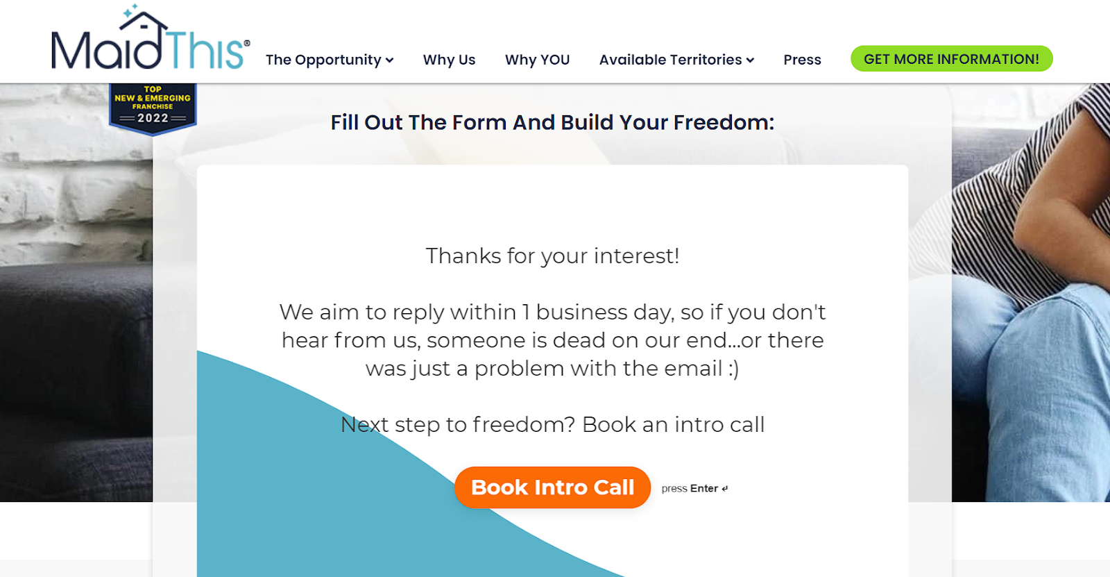
Source: maidthisfranchise.com
Moreover, MaidThis takes it a step further by integrating a Calendly invite at the end of the contact form. This thoughtful addition empowers prospects to schedule a meeting at their convenience, aligning with the modern desire for autonomy and efficiency.
By doing so, MaidThis nurtures potential leads through additional touchpoints, demonstrating a deep understanding of the high-touch sales cycle in the B2B arena.
Highlight Testimonial Content That Appeals to Business Customers
The power of social proof cannot be overstated. Testimonials and reviews play a crucial role in building trust and credibility. However, it’s essential to showcase testimonials that resonate with the specific needs and concerns of business customers.
Here’s how to effectively highlight testimonial content for a B2B audience:
- Address pain points.
Focus on testimonials that speak directly to common challenges faced by business customers. This could include improving efficiency, reducing costs, or solving specific industry-related problems.
- Showcase ROI and impact.
Business customers are keen on understanding the return on investment (ROI). Highlight testimonials that detail tangible benefits, such as increased sales, improved customer satisfaction, or significant time savings.
- Feature industry leaders.
Testimonials from well-known industry figures or reputable companies can significantly enhance credibility. They serve as a powerful endorsement of your product or service.
- Ensure that the testimonials are authentic and relatable.
Authentic testimonials that reflect real experiences are far more impactful than generic or overly polished ones.
At Martal, we, leverages the power of customer reviews on our homepage. Our testimonial section is strategically designed to address the common concerns and needs of B2B tech companies.
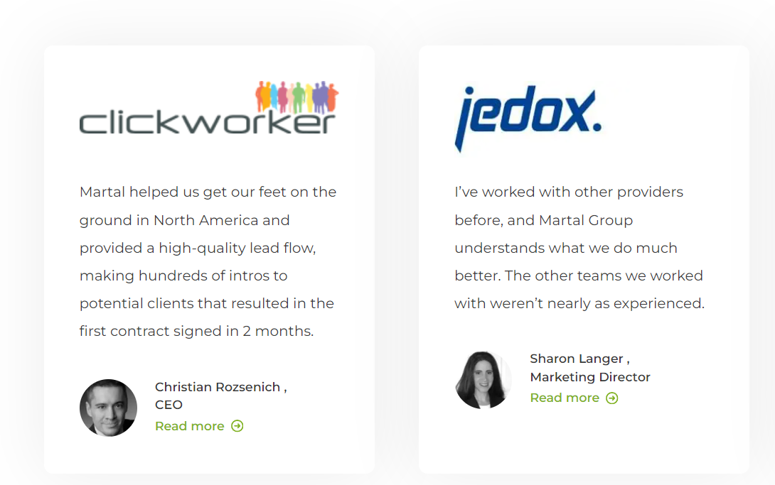
The content we display in this area is carefully curated to resonate with our target audience. These testimonials specifically highlight how Martal has helped businesses improve lead generation, streamline their sales processes, and ultimately drive growth.
By focusing on real results and customer success stories, we effectively communicates the value of their services.
Find a Balance between Minimalism and Detail
There’s a fine line between providing enough information and overwhelming your audience. Especially in a B2B context, where the details of a product or service can be complex, striking the right balance is key. Businesses planning a website redesign should focus on this balance as well, ensuring the updated site not only looks modern but also provides the right amount of detail to guide users without overwhelming them.
Here’s how businesses can achieve this equilibrium:
- Design a layered information architecture.
Organize content in a way that allows users to navigate from general overviews to more detailed information as needed. This tiered approach caters to both quick browsers and those seeking in-depth details.
- Add interactive elements for detailed exploration. Use accordions, tabs, or hover effects to reveal more information. This keeps the initial view clean while allowing users to delve deeper on demand. You can also add a social media QR code on your website which people can scan to be redirected to your social media accounts.
- Make your copy clear and concise.
To maintain clarity across languages, it is helpful to use professional translation services.
- Provide visual aids.
Employ diagrams, infographics, or icons to convey complex information more straightforwardly. Visuals can often communicate what paragraphs of text cannot.
- Utilize whitespace and design aesthetics.
This can help you create a clean, uncluttered look.
Lanteria, an HR management platform, serves as an excellent example of balancing minimalism with detail in UX design. Their homepage stands out for its uncluttered layout while still maintaining a strong focus on product details.
The key lies in how they present their platform’s features. Lanteria uses clickable fields that, when interacted with, display an image and further details about the specific feature. This approach allows users to explore the product at their own pace, without being overwhelmed by information upfront.
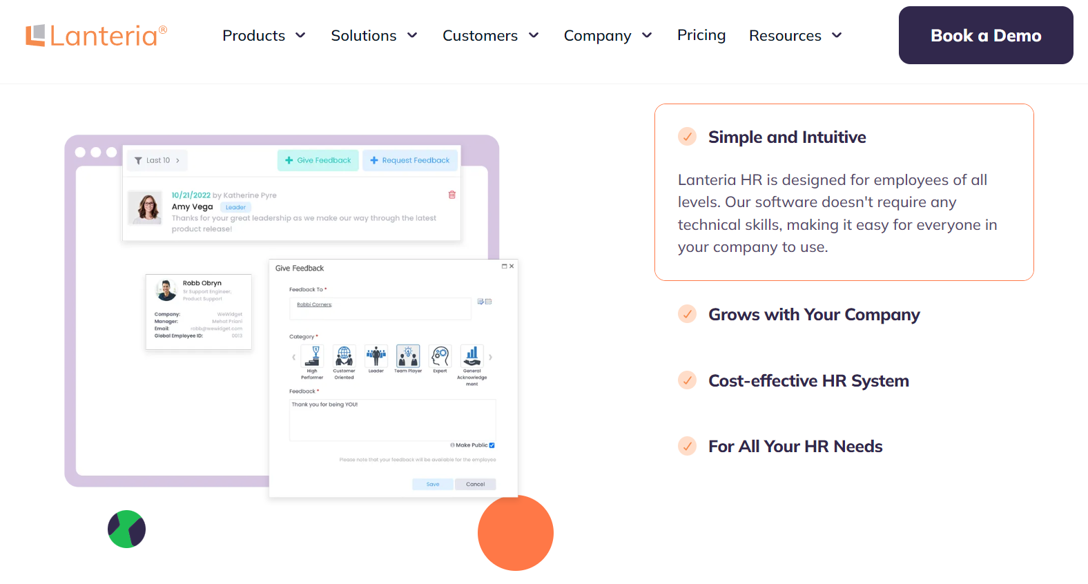
Source: lanteria.com
Such an interactive way of showcasing features ensures that users are not bombarded with details all at once. Instead, they have the control to delve into the aspects they are most interested in, making the exploration process more engaging and less daunting.
Be Upfront about Pricing
Transparency in pricing is crucial, especially in the B2B sector, where buyers conduct extensive research and comparisons before making a decision. A clear, straightforward pricing page can greatly influence a business customer’s decision-making process.
Here’s how to create a pricing page that meets these needs:
- Clearly display your pricing options.
Present your pricing tiers or packages in a clear, easy-to-compare format. This helps clients understand what they’re getting for their investment.
- Provide detailed service descriptions.
Alongside each price, detail what the service includes. This clarity helps businesses evaluate the value proposition of each tier or package.
- Avoid hiding additional fees.
Ensure that any extra costs, such as setup fees, are clearly stated. Surprises in pricing can lead to mistrust and lost sales.
- Add comparisons to market standards.
If appropriate, show how your pricing compares to market standards or competitors. This can position your offering more favorably.
La Jolla Detail, a mobile car detailing service, illustrates how to effectively present pricing information, catering to a discerning clientele who value clarity and detail in service offerings.
On their pricing page, La Jolla Detail transparently lists their various detailing packages, clearly outlining what each package includes and its respective price. This level of detail empowers customers to make informed decisions based on their specific needs and budget.
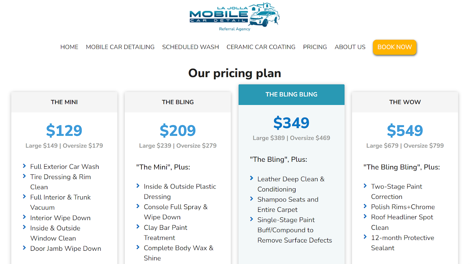
Source: lajolladetail.com
Another great example is how this Metronet-authorized reseller displays its view pricing page. Not only are they upfront about the promotion, but they also clearly display the normal pricing so buyers do not feel hoodwinked into highly inflated monthly bills.
By presenting a straightforward breakdown of services and costs, they respect the client’s need for clear information – a practice that’s highly valued in business transactions.
Their approach demonstrates that when dealing with business clients, transparency in pricing and services is a universal best practice that fosters trust and reliability.
Tell Customer Stories through Case Studies
Case studies are a powerful tool for illustrating the value and impact of your products or services. They provide tangible proof of success and can significantly influence decision-making processes.
Here are some best practices for creating compelling case studies:
- Detail the problem and solution.
Clearly outline the client’s initial challenges and how your product or service provided a solution.
- Specify quantifiable results.
Include data and metrics that demonstrate the tangible benefits your client received. Numbers speak volumes in a business setting.
- Incorporate direct quotes from your clients.
This adds authenticity and a personal touch to the stories.
- Use visuals like graphs, images, or videos.
They’ll make the case study more engaging and easier to digest.
- Avoid jargon and overly technical language.
Make the case study easy to understand for a broad audience.
Zendesk, a sales CRM platform, offers an exemplary case study showcasing how they helped a client build trust and efficiency. Their approach is thorough, detailing the process of their intervention with precision. The inclusion of customer quotes adds a personal dimension, while visuals help to break down complex information.
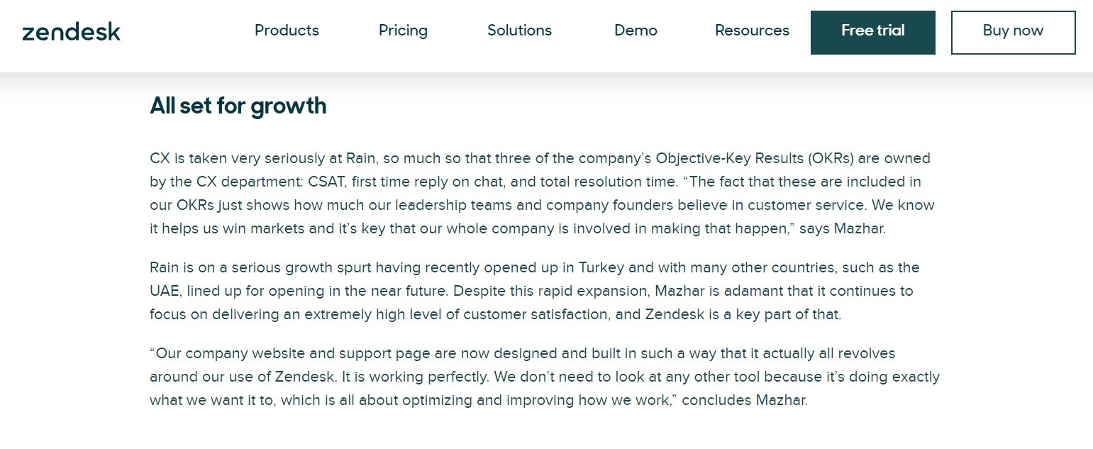
Source: zendesk.com
This detailed format is especially beneficial for clients who are looking for a deep understanding of how Zendesk’s solutions can be applied to their own challenges.
On the other hand, Cude Design, a web design agency, takes a more accessible and conversational approach in their case studies. For example, their case study on a professional redesign for an outdated recruitment website is concise and to the point.
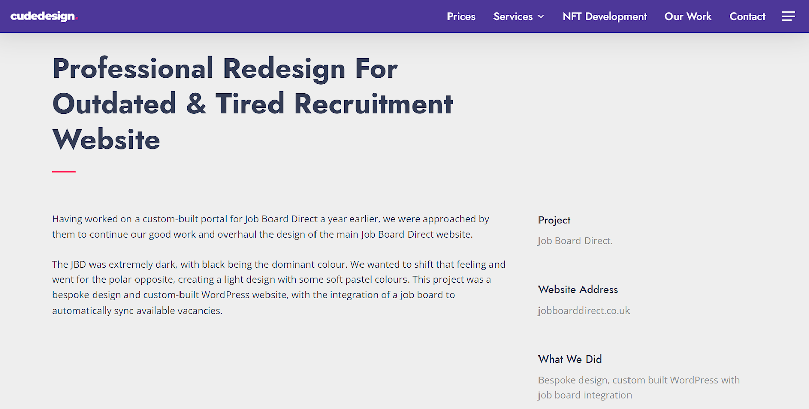
Source: cudedesign.co.uk
This style is ideal for prospects seeking quick solutions and wanting to grasp the potential impact without investing much time. The straightforward, easy-to-follow format ensures that the key message and value of their service are communicated efficiently.
Personalize the Buyer’s Journey
As a B2B business, it’s crucial to guide each visitor through a tailored path that aligns with their specific needs and interests. This approach enhances the user experience and increases the likelihood of conversion.
Here’s how to effectively personalize the buyer’s journey:
- Provide segmented user paths.
Offer different pathways on your homepage or landing pages based on visitor types or interests. This allows users to quickly navigate to the information most relevant to them.
- Use dynamic content that changes based on user behavior or preferences.
This could include personalized product recommendations or content tailored to the visitor’s industry.
- By leveraging the capabilities of the best digital experience software, you can create highly engaging and personalized user journeys that drive conversions and customer satisfaction.
- Add interactive tools.
Implement tools like quizzes or surveys that help visitors identify their needs and direct them to the appropriate solutions.
- Enable a clear and intuitive navigation.
Ensure that your website’s navigation is intuitive and guides visitors toward their areas of interest without overwhelming them with options.
- Utilize feedback loops.
Incorporate feedback mechanisms to continually refine and improve the personalization of the journey.
Monday, a work management and sales CRM platform, masterfully personalizes the buyer’s journey right from the moment a visitor lands on their website. Upon arrival, visitors are immediately presented with a choice of features tailored to different needs and use cases.
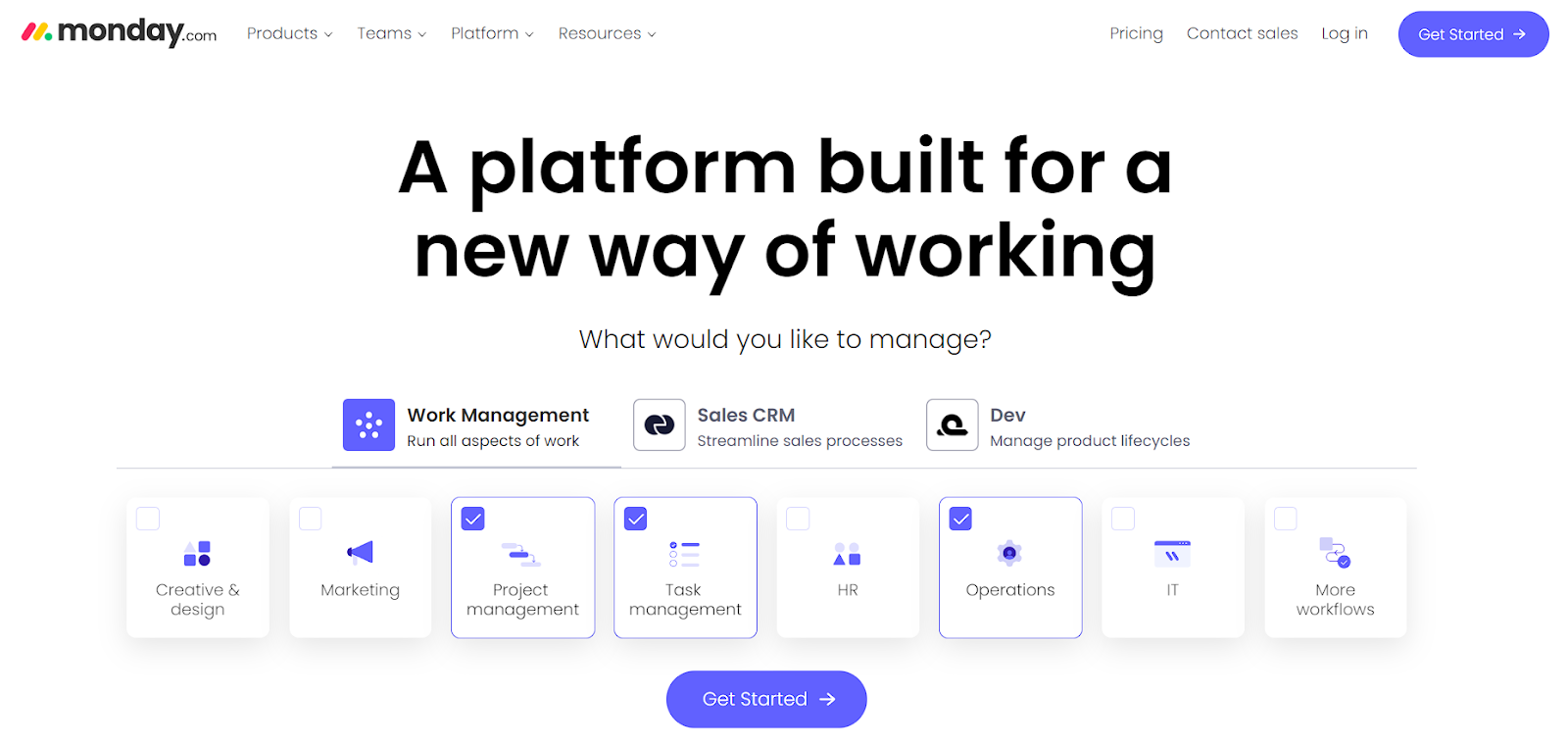
Source: monday.com
This user-centric approach allows visitors to select only the options they are interested in, effectively creating a customized journey. As they continue exploring, their experience is tailored to the pathway they’ve chosen, providing a more focused and relevant exploration of Monday’s services.
Tailor CTAs to Specific Business Needs
The effectiveness of a Call-to-Action button (CTA) hinges on its relevance and precision to the audience. Unlike B2C, where generic CTAs like “Buy Now” or “Sign Up” might suffice, B2B requires a more nuanced approach. Tailoring CTAs to specific business needs can significantly enhance engagement and conversion rates.
Here’s how to adjust your CTAs as a B2B business:
Understand and segment your audience.
Dive deep into the needs, challenges, and goals of your target audience. The more you understand them, the better you can tailor your CTA to resonate with their specific situation.
If you discover different segments within your audience, consider creating different CTAs for each group. This can help in addressing the specific requirements of each segment.
Be specific with language.
Use language that directly speaks to the actions you want the audience to take, and ensure it aligns with their professional needs. For instance, instead of “Get Started,” a CTA like “Schedule Your Demo” might be more appropriate for a software solution.
Highlight the benefits.
Make sure your CTA clearly conveys the benefit the user will get. If your service saves time, a CTA like “Save Time with Our Solution” can be effective.
Transfix, an AI-powered freight brokerage platform, is a stellar example of using tailored CTAs effectively. They prominently feature CTAs like “Ship with us” and “Haul with us,” which are strategically crafted to appeal to distinct segments of their audience – shippers and carriers, respectively.
This targeted approach immediately grabs the attention of website visitors by speaking directly to their specific interests and needs.
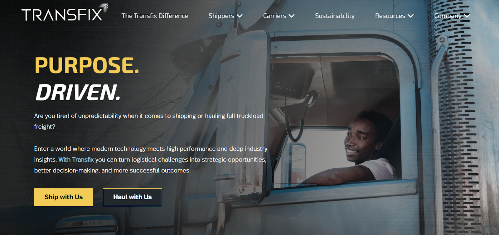
Source: transfix.io
By using such specific CTAs, Transfix enhances the relevance of their messaging while improving the chances of engaging each segment of their audience in a meaningful way. It demonstrates a keen understanding of their users’ needs and positions their platform as a solution-oriented service, ultimately driving higher engagement and conversion rates.
Final Thoughts
The tactics we’ve explored in this article, illustrated with real-life examples, provide actionable insights for businesses aiming to refine their online strategy.
But, as the digital B2B landscape evolves, so should they. Continuously testing, learning, and adapting will ensure that your website remains a relevant and effective sales asset in the ever-changing world of B2B commerce.