Four Best Practices for Creating High-Converting Product Pages

How do you convert first-time web visitors into customers of your brand? At first glance, the answer may seem simple. All you need to do is offer prospects a great product at a fair price and promise (then deliver) an exceptional customer experience.
But the thing about running a B2B company is that converting a potential lead into a loyal client isn’t all that simple. Survey data shows that 77% of B2B buyers say their latest purchase was very complex. Moreover, it involved six to 10 decision-makers, each considering four to five key pieces of information.
So how do you create a high-converting product page that meets all these demands? Here are the best practices to follow to ensure your hard work translates into profits.
Be Clear About What You Bring to the Table
The first thing you must understand about B2B conversions is that most of these purchases involve a considerably high level of risk. Professionals and organizations searching for solutions know they’re facing a long onboarding period that often encompasses dozens (if not more) of users and a considerable cost.
In other words, when targeting professionals and brands, you need to be acutely aware of the fact that a sale is not just a transaction. Instead, it’s the first step towards building a lasting relationship with your clients.
One of the best ways to successfully take that first step is to optimize the value propositions on your product pages. Be very clear about:
- what you bring to the table
- how your solutions benefit your potential clients
- what features they will get access to after converting
This way, you can effectively convince prospects to try your products and slowly start making them an integral part of their workflows.
For an excellent illustration of how to do this, check out MailChimp. You’ll see that the brand’s Email Marketing product page utilizes a direct yet compelling value proposition. It invites prospects to “win customers,” highlighting that the company is “the #1 email marketing and automations brand.”
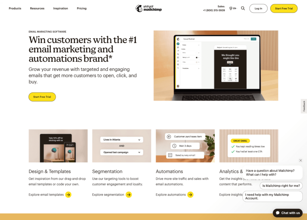
The biggest triumph on this product page is, without a doubt, the value proposition. It’s not only well-worded but also addresses the brand’s target audiences’ primary pain points and instantly offers a solution.
But if you want to learn everything you can from this high-converting product page, take a better look at the hero section. You’ll notice the smart layout choice, which allows web visitors to see the product’s main features — design & templates, segmentation, automation, and analytics & AI — in the first screenful of the page. The design choice allows these product attributes to capture web visitors’ attention without relying on people’s willingness to scroll.
Deliver an Unmatched Shopping Experience
The second thing you must do if you want your product pages to reach higher-than-average conversion rates is to deliver a shopping experience that’s hard to say “no” to.
Do your best to design your website in a way that prioritizes your prospects’ shopping experience. That way, you’ll create a space where potential clients can get a taster of the quality of service you can deliver.
Remember, an enjoyable web user experience directly translates into higher conversion rates. And, consequently, it creates more value for your business. (In fact, data shows that the annual cost of poor UX falls at approximately $62 billion, making it crystal clear that you must deliver an exceptional shopping experience for your audience.)
But how do you create product pages that convert via the power of browsing experience? Well, there are several elements that you can optimize to guarantee above-average CRs.
Product Page Technical Performance
Firstly, invest in technical page performance — namely, loading speeds, responsiveness, and intuitive navigation.
By ensuring that product pages match your target audience’s expectations (i.e., they load quickly, display well on all screen sizes, and utilize well-established design protocols), you can effectively prevent prospects from becoming overwhelmed and frustrated. Additionally, doing this can help you leave a positive first impression, maximizing web visitors’ chances of converting into customers.
Optimizing Copy and Visuals
Make sure that your product descriptions are composed in a way that’s entirely user-oriented:
- Address your audience’s pain points and say/show how your solution removes/solves the issue.
- Use language aligned with your potential customers’ position in the sales funnel. If you’re targeting professional users and businesses, you can get away with using industry-specific jargon. Nonetheless, check the readability levels of your product page copy to guarantee that you’re not alienating potential clients due to overly complex product descriptions.
- Don’t forget to present users with the technical information they need to justify investing in your products. In-depth product spec sheets will be a core sales driver when targeting professional users and organizations. After all, your future customers don’t just need a good solution. They need one that can allow their businesses to improve performance, boost profits, or lower operational costs.
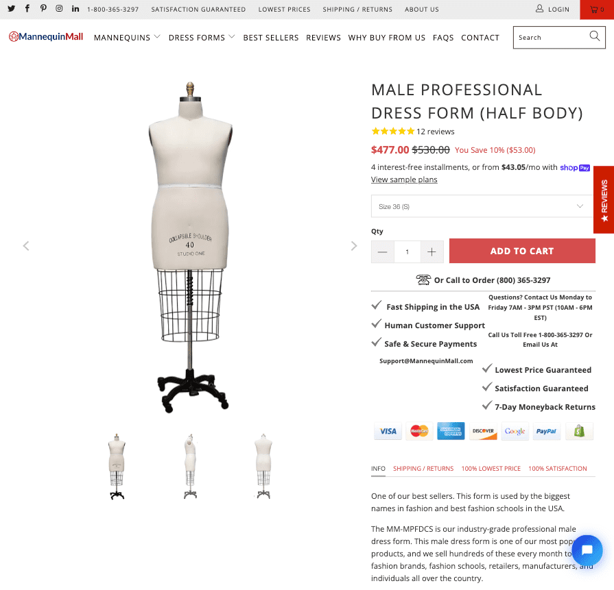
For example, if you check out Mannequin Mall, you’ll see how much info the brand offers on each product page. The copy doesn’t just describe each mannequin/dress form. It also specifies why the brand uses specific materials, how tailors can adjust the form, and how the materials will react to pinning. This is essential information for someone using the product to sew garments. Moreover, the product page includes a detailed size table, a crucial element in the fashion industry.
Images and Videos
To improve your web visitors’ shopping experience, employ product page features that will impress your prospects via the power of visual information.
Utilize high-quality images and consider using explainer videos in addition to product photos. Statistical data shows that video is especially effective at boosting conversion rates, with 89% of consumers saying they have been convinced to buy a product or service and 79% to invest in a software or app by watching a video.
For inspiration on implementing this conversion-boosting strategy on your product pages, check out Shop Solar Kits. The brand includes several educational videos on its product pages, aiming to familiarise buyers with the elements of an off-grid solar power grid system.
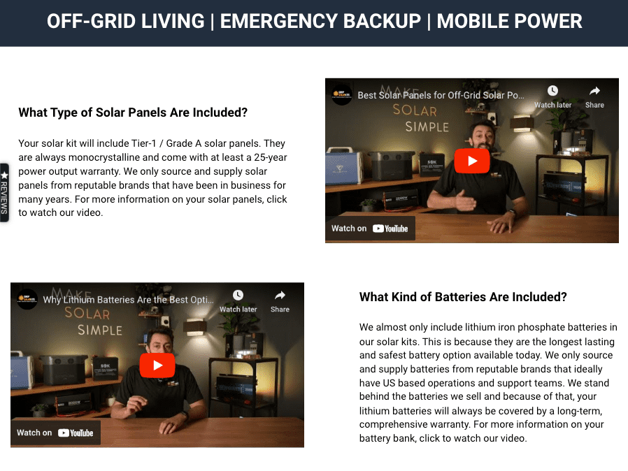
Note how the videos address complex technical features in a generalized way. This makes them easy to reuse on multiple product pages. Plus, the approach allows the business to repurpose existing video content, reaping its conversion-inspiring benefits while getting access to content that can be distributed via multiple content marketing channels.
Advanced UX Features
Finally, remember to predict and meet your target audience’s needs.
B2C e-commerce brands do this particularly well, as they often employ bundling, upselling, and cross-selling strategies. All these tactics rest on the idea of encouraging consumers to buy everything they need before they even know that they need multiple products.
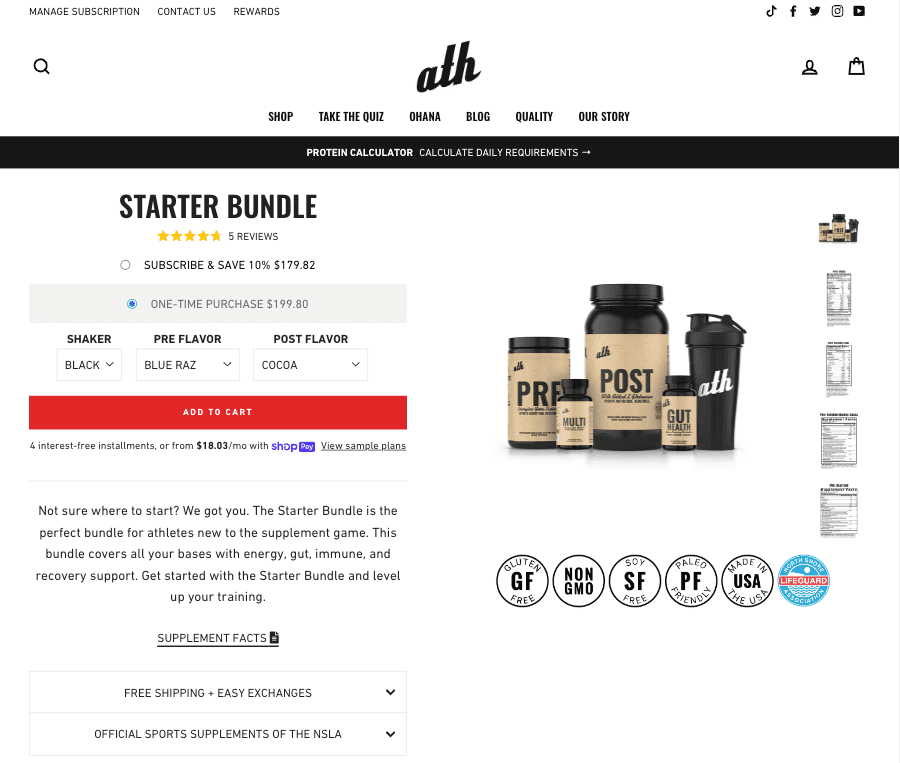
The great thing about this approach to improving product page conversions is that it’s relatively easy to design. All you need to do is use your expertise to create bundles and then show your prospects why investing in multiple products benefits them. For instance, if you check out the ATH Starter Bundle product page, you’ll see that the copy states that the bundle was made for buyers who aren’t sure about the products they need for the best results. Of course, that doesn’t prevent potential buyers from choosing what they like — they can still use the dropdown menus to pick supplement flavors. But, the process of putting together an order is made considerably easier, automatically preventing decision fatigue and ensuring that interested prospects actually convert instead of delaying their purchasing decision or choosing a simpler product option from the brand’s competitors.
Show Your Commitment to Customer Satisfaction
One of the key differences between the B2C and B2B customer journey is that professional users have far more complex requirements than end consumers. And while this means that they’re (usually) prepared to opt for solutions with steeper learning curves (as long as those deliver sufficient value to justify the purchase), it also indicates a core difference in their customer service requirements.
In the simplest of terms, B2B companies must be prepared to go above and beyond with customer service to convince their target audience to convert. And, sure, a lot of this work will be performed post-sale. However, when aiming to improve conversion rates, it’s not a bad idea to show how your organization intends to ensure its clients are happy with their purchases.
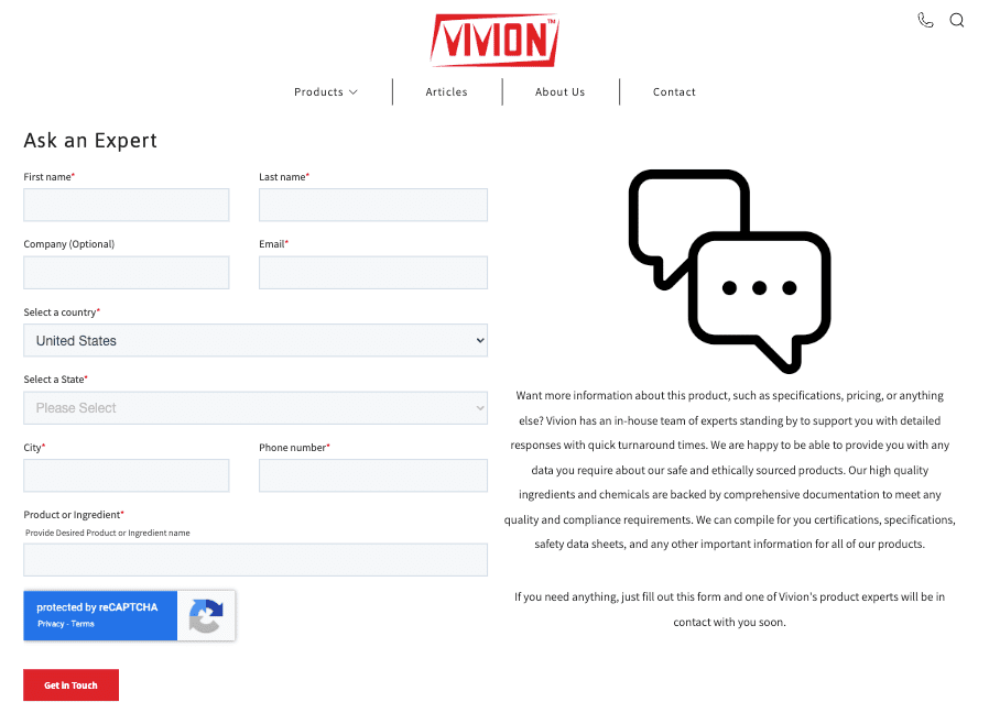
For example, one way you can use product pages to convince your audience that they’ll be happy with their purchase is to show that your products and services also come with access to your team’s expertise. On Vivion, each product page includes an Ask an Expert section. Here, potential buyers can submit their questions and receive feedback from the brand’s specialists, who can answer technical questions about the ingredients and chemicals sold by the company.
Or, of a slightly more common way to prove your commitment to customer satisfaction, enrich product pages with B2B-oriented instances of social proof such as awards, certifications, case studies, or statistics — as done on the Gusto Payroll product page. These page elements won’t just build trust and inspire sales. More importantly, they’ll set your prospects’ expectations regarding the results your solutions can deliver. This will prevent the disillusionment that often happens when brands overpromise and then underdeliver.

Get the Pricing Right
Finally, don’t forget that your audience is guaranteed to consider price before investing in a product. And although B2B customers may be prepared to spend more on a solution that does what they need, it’s still essential to plan your pricing strategies in a way that will convince your audience that they’re getting a good deal.
Fortunately, there are a couple of proven-to-work tactics to help you achieve the desired goal.
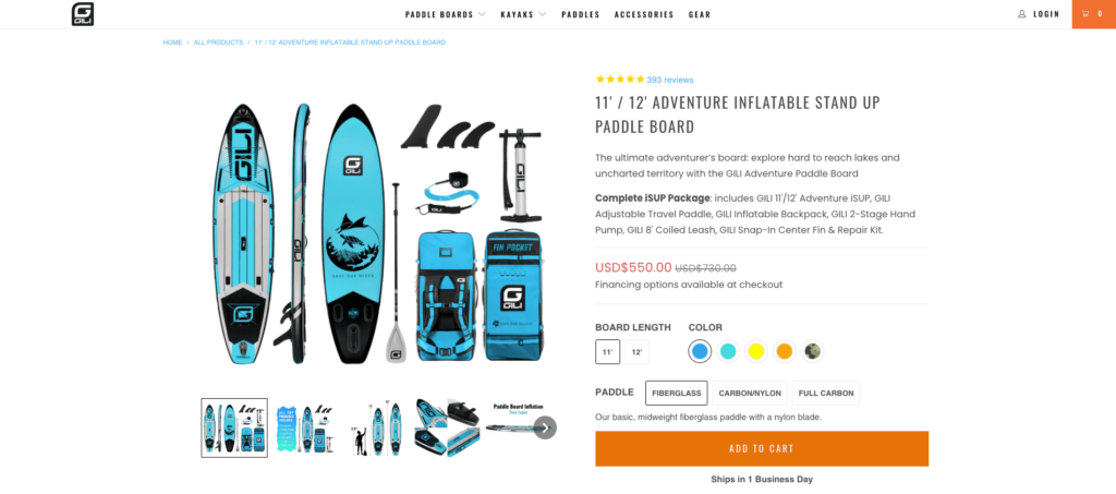
The first is to use anchor pricing. This will enable you to encourage web visitors to associate your solutions with high value, then convince them to convert by calling their attention to the fact that they can acquire said value at a discounted price.
It’s what most e-commerce brands do — check out the example by GILI below — as it’s an effective way to boost sales while being relatively easy to accomplish design-wise.
The alternative to anchoring via monetary value is to highlight worth through feature access. This model is most commonly used by SaaS brands like Slack, which target a wide variety of users whose needs greatly vary.
Feature-based pricing is an excellent option for businesses aiming to convert leads. It allows for free solution access that helps create a wide customer base while still leaving plenty of room for making a profit by charging for advanced functionalities.
