Landing Page: Build Cleverly and Avoid Mistakes

Landing pages are one of the most important instruments of online marketing campaigns. The nice thing about them is: they can be created easily. For this you just need one of the many homepage builders or a good graphic program. But one look at different landing pages will demonstrate that the same mistakes are made over and over again. Find out now what those are, how to do it better and what is truly important when it comes to landing pages.
General Info about Landing Pages
What is a Landing Page?
A landing page is an internet page that was created only for a specific marketing campaign. It is reached by a click on a banner ad, an online advertisement, a search engine entry or something similar. It is not part of a normal company homepage, and is also not usually reached through its navigation.
Goal of a Landing Page
A landing page encourages visitors to perform certain actions. This can be subscribing to a newsletter, downloading software, contacting a company, or ordering an item / service. It is put this way in marketing jargon:
The goal of a landing page is conversion!
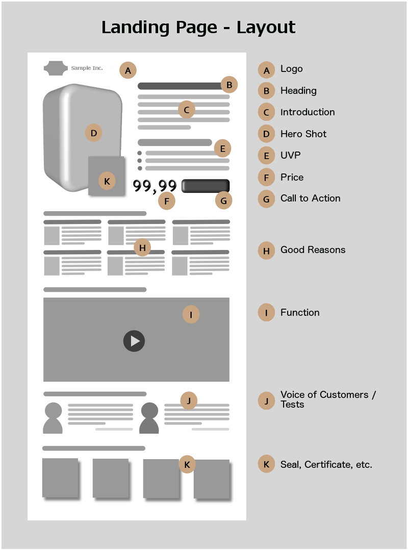
General Layout
Please note:
To avoid any confusion of terms, from this point on we are talking only about a product and its sale. Of course this landing page structure is also valid if you are offering a service, are looking for subscribers, want to establish contact etc.
(A) Logo
As a rule, the company logo is placed in the upper left corner. The visitor expects it in this spot. Clicking on it should take you to the actual company homepage.
(B) Heading
Here the keyword, which was used for say the ad or banner, is taken up again. The visitor then immediately sees that he’s on the correct website. If a short, catchy slogan was used for the advertisement, then that should be the heading. Of course further explanatory sub-headings can also be added.
(C) Introduction
This should quickly make clear to the visitor why he needs this product. The rule here is keep it short and sweet. Long-winded explanations have no place here. Repeating the keyword is completely acceptable.
(D) Hero Shot
EA well-staged product image is called a hero shot. It appeals to the visitor in such a way that he wants to buy the item immediately. The hero shot can also be a short video, the focus of which is always the product.
(E) UVP
The Unique Value Proposition outlines the benefit of the product. Here, too long explanations are undesirable. The best thing to do is list the advantages in bullet point form. This way the visitor can take them all in with one glance.
(F) Price
Only death is free, at least for the one dying, so the price is no secret. Where there is more than one possible price, the pricing structure should be explained. Limited time special pricing, reduced prices, and free gifts with purchase can also motivate visitors to buy.
(G) Call To Action
So that the visitor doesn’t have to search very long for how to buy the product, the “buy now” button should be placed prominently. Incidentally it doesn’t need to be a button, a link or something similar can also be used. In any case the visitor must immediately see: this is how I get the product.
(H) Good Reasons
Good reasons are required to convince the visitor about the product. When listing these you can also draw on statistics, easily understandable arguments, etc. And don’t forget about feelings!
For more on this see: Emotion is More Important than Reason
(I) Function
In this section you can get factual, but not dry. Explain your product’s function in a picturesque way. Images or a short explanation video are advisable here.
(J) Voice of Customers / Tests
Do customer feedback or even product tests already exist? Very good. These should definitely be included on the landing page. This creates trust. As reviews on Amazon alone show, customer voices are one of the most important decision-making tools for the purchaser.
(K) Seal, Certificate, etc.
Seals, certificates, or Facebook likes create trust in the product and the seller. In the end, the visitor wants to be sure that in the case of a purchase he won’t be disappointed.
Eleven Common Landing Page Mistakes
1. Various Layouts and Slogans
The corporate design concept must also be kept in mind with the landing page. The visitor arrives at your landing page through a click on a banner. At first glance he has to understand: this is the right page. Coloration, font, images, and banner design absolutely must turn up again on the landing page.
In addition, slogans used in the advertisement or on the banner need to be present on the landing page. If for example the ad touts “white teeth in 10 days,” then the title on the landing page can’t just say “buy great toothpaste.” The slogan should be repeated here.
2. Unprofessional and Confusing Design
Even though landing pages are very easy to create yourself, the design can’t come off as unprofessional. Why? It allows the visitor to doubt the integrity of the offer.
The page design should be appealing and above all clearly organized. This includes graphics or a video just the same as crisp headings and short paragraphs. Enumerations are also important. The visitor must understand as quickly as possible what it’s about and what he can do.
General rule for layout and text: Less is more!
3. Poor Hero Shot
The product image is the first thing a visitor sees. It has to speak to him. It’s better to let a professional handle this, rather than “snapping” a bad picture yourself. When a service or something similar is being advertised, then also show that in its best light. Just buying an image from a photo database could prove embarrassing. Imagine if your competition used the same photo.
4. Features Instead of Benefit (Wrong UVP)
The UVP (Unique Value Proposition) is supposed to persuade the visitor about the product. It tells him what unique utility this product has for him. Unfortunately, features are often confused with benefit.
Example:
If you want to sell a digital video recorder, don’t list its disk space here. Say how many full HD films or UHD films it has space for. Mention the intelligent recording electronics, but don’t explain its algorithm. Write about how the digital video recorder automatically records the movies that the customer likes.
5. External Links
Under no circumstances should the landing page visitor be distracted. So, don’t refer to external websites in the text that might entice him to continue surfing elsewhere. This is the reason a landing page includes no navigation. Anchor links to jump around the page are acceptable however.
6. Too Many Options
If product A is supposed to be sold on the landing page, then it is unwise to allude to product B. Or the visitor can decide to first order a newsletter before he makes a purchase. Or he can also take part in a survey. Or this, or that or the other… A landing page is about one single thing.
7. Technical Jargon and Run-on Sentences
Technical terminology prevents the visitor from understanding what’s going on. It can also cause confusion. This may have even happened to you with this post. When UVP was mentioned, did you really think of “unique value proposition” or instead maybe about something like “variable pricing”?
Long, convoluted sentences are also very difficult to understand. The shorter and simpler the sentences are, the better. But they can of course still be shrewdly and elegantly formulated.
8. Asking Too Much of the Visitor
The displaying of seals, customer feedback, or tests serves one purpose: to gain the customer’s trust. However, even a hundred certificates or favorable customer opinions can’t always make that happen. Especially when the purpose of the landing page is to request sensitive information from the visitor, then seals aren’t much help. The ticket here is to shift into a lower gear and collect less information. Then, when the customer has established trust, the next step can be taken.
9. False Promises
False promises on the landing page are absolutely taboo. If for example you promise a no cost software download, then it should really be free. After all you want your company to be considered respectable.
10. Long Loading Times
A landing page that takes too long to load costs visitors. It has been ascertained that one additional second of loading time decreases the conversion by seven percent.
Tip: With PageSpeed Insights from Google you can analyze your page’s loading time very easily. This no cost tool can also help with page optimization..
11. Untested Launch
Unfortunately only 52 percent of businesses test their landing pages. By not doing so you’ll never know if it’s functioning, even when all marketing rules have been followed. A test is therefore essential. So-called A/B tests have proven to be especially effective here. For this test, 50% of the clicks on an advertisement are directed to landing page A and the other half to landing page B. Pages A and B are the same at the beginning, but specific elements are then changed on page B. The element could be a new hero shot, changing the style of address from formal to more familiar, etc. After each step where an element is altered, web analysis is used to examine how the conversion rate changed when compared to page A. In this manner, an ideal landing page can be created for a campaign.
Would you have ever thought?
Thanks to extensive A/B tests Obama was able to collect an additional 60 million dollars in donations.
General Rule for Landing Pages: Emotion is More Important than Reason
In our research for this post we found that all experts agreed on one point: emotion is the most important thing. It is the basis on which the visitor makes his decision. He merely justifies it afterwards with reason.
But how can you appeal to your visitors emotionally?
Inspiring Content
Don’t show what your product can do in the texts and images, instead show what it makes possible. The best example for this is lottery advertisements. They hardly ever depict money, the actual winnings. They present people on the ideal beach, in sports cars or villas. That has nothing to do with the product itself, but they are desires tied to it. They can be fulfilled with a lottery win.
If your product for instance saves the customer time, then let the customer experience what he can do with that extra time.
Personal Connection
Many purchase decisions depend on personal appeal.
Do I like the seller? Do I trust him?
Yes! Good, then I’ll buy the product.
So show your company’s employees on your landing page with the product, or give the boss a chance to speak.
Personal motivation also goes along with this. Why did you / your company of all people develop this product? What does it mean to you?
In so doing the customer then isn’t buying the item from an anonymous company, but from real people.
Appealing Design
Present your product in appropriate surroundings. Pleasant hues and pleasing graphics are fun for your visitors and provide a positive feeling. Color psychology can help with this. A creative graphic designer, a photographer or even a painter / illustrator can provide the right images.
Our Last Tip
Breaking the Rules
Even marketing rules are not carved in stone, so try out different things with your landing page. We heartily recommend using A/B tests for this. And don’t overthink the page. Dare to take the step of putting it on the web without having brooded over it for two years. You can still optimize the page then, based on feedback that you get from visitors and web analysis tools.

