Technology
 Education and training
 Web Development and UI / UX
 Healthcare/Medical
 Logistics and Supply Chain
 Information Technology
 Insuretech and Financial Services
 Marketplaces
 Software Development
 E-commerce and retail
 AI and Machine Learning
 Energy and Solar
 Security and Surveillance
 Digital Marketing Agency
 Transportation
 MSP
MSP
 Telecom
 B2B SaaS
 Cybersecurity
 HR tech
 Fintech
 Cleantech
 Consulting
From Data to Dollars: Build a Pipeline Report That Accelerate Sales in 2026
Major Takeaways: Pipeline Report
A well-built pipeline report gives sales leaders real-time visibility into deal flow, bottlenecks, and forecast accuracy—helping drive faster, data-backed decisions.
Focus on pipeline value, coverage ratio, win rate, average deal size, and sales velocity to evaluate both quantity and efficiency of sales opportunities.
Weekly pipeline reporting ensures early detection of stalled deals and accurate forecasting—high-performing teams review data in real time for agility.
AI-driven tools automatically capture CRM data, score deal health, and predict close probabilities, improving forecast accuracy by up to 30%.
Executive-ready reports emphasize clarity, visual storytelling, and actionable insights—turning complex data into strategic growth decisions.
Companies with structured pipeline reporting see up to 28% higher annual revenue growth by converting insights into faster, more predictable sales cycles.
Maintain CRM discipline, automate data updates, and align sales-marketing definitions to ensure your pipeline remains accurate and actionable.
Automated dashboards provide real-time updates, highlight risks instantly, and help executives act on opportunities before they stall.
Introduction
Is your sales pipeline report truly driving growth – or just gathering dust? In today’s data-driven B2B landscape, having a clear window into your sales pipeline is non-negotiable. By 2025, a staggering 80% of B2B sales interactions occur in digital channels (9). This shift means you need real-time visibility into every deal’s status, from initial lead to closed sale. A modern pipeline report provides exactly that: it shows you how many deals are in each stage, their value, and where opportunities are stalling or advancing (13).
When done right, pipeline reporting becomes your strategic advantage. It allows you to spot bottlenecks early, coach your team more effectively, and forecast revenue with greater confidence. In this guide, we’ll break down what a sales pipeline report is and why it matters to executives, highlight the key metrics and best practices that make these reports effective, and show you step-by-step how to build a pipeline report that accelerates growth. We’ll also discuss common challenges, the growing role of AI and automation in 2026, and a real-world use case illustrating how better pipeline reporting can boost your sales performance.
Whether you’re a CMO, CRO, VP of Sales, or SDR leader, this comprehensive guide will help you transform pipeline and B2B reporting from a routine task into a powerful growth engine. Let’s dive in and ensure your pipeline report becomes a springboard for revenue growth – not just a rearview mirror.
What Is a Pipeline Report?
Companies that monitor their pipeline and conversion performance have a 10% higher chance of achieving annual revenue growth.
Reference Source: Forbes
In simple terms, a pipeline report (or sales pipeline report) is a visual snapshot of all the deals in your sales pipeline and where they stand. It tracks opportunities as they move through defined stages – from new lead, to demo, to proposal, to closed deal – and shows how many deals are at each stage, and the total value they represent (14) (13). Essentially, it’s a report that answers “What’s in our sales funnel right now, and are we on track to hit our targets?”
A good pipeline report will typically include:
- Deal counts and values by stage: e.g. 10 deals in Proposal stage worth $500K, 5 deals in Negotiation worth $300K.
- Overall pipeline value: the sum of all open opportunities (sometimes weighted by win probability for forecasting).
- Key metrics per stage: conversion rates, average time in stage, win rates, etc. (more on these later).
- Forecast information: an estimate of how much revenue is likely to close in a given period, based on the pipeline data.
Importantly, a pipeline report is not the same as a general sales performance report. A sales performance report might look at bookings, quotas, and historical sales results. In contrast, a sales pipeline report is forward-looking – it’s about current opportunities and future revenue. As one source puts it, “using reports, you can predict when opportunities will close and how they impact your revenue” (15). It bridges the gap between raw CRM data and actionable insight, helping you understand where every deal stands today and what’s likely to happen next.
Many teams use CRM software (like Salesforce, HubSpot, or Pipedrive) to automatically generate pipeline reports. These tools can visualize your sales process with funnel charts or dashboards, making it easier to analyze and act on the data. The bottom line: a pipeline report gives you a real-time health check of your sales funnel. It provides the clarity and context needed to guide decision-making – from coaching reps on deals, to allocating marketing resources, to forecasting revenue for the quarter.
What Makes a Pipeline Report Effective for Executives?
67% of executives rely on reports for decisions, yet 42% struggle with data. Automation cuts analysis time 45% and boosts accuracy.
Reference Source: Centure Interactive
Not all reports are created equal – and busy executives won’t hesitate to tune out a report that doesn’t deliver value. So, what makes a pipeline report effective for CEOs, CMOs, CROs and other execs? In a word: strategic clarity. Here are the key ingredients that executives love to see in a pipeline report:
- Easy to understand: Executives should be able to grasp the story at a glance. That means a clear layout and simple visuals. Any leader looking at your report should instantly know what the data means and where the pipeline stands (2). Avoid drowning them in granular details. Instead, highlight the big-picture indicators (pipeline size vs. target, win rates, forecasted closes, etc.) in a clean, digestible format.
- Relevant & high-impact metrics: Focus on the metrics that matter to business outcomes. A common mistake is stuffing every possible sales stat into the report – which only causes eyes to glaze over (2). Executives care about numbers that drive decisions: Are we likely to hit the quarterly number? Do we have enough pipeline coverage? Where are deals getting stuck? Stick to high-level sales KPIs like total pipeline value, pipeline coverage (pipeline-to-quota ratio), conversion rates, sales velocity, and forecasted revenue. We’ll detail these metrics shortly – the point is to prioritize quality over quantity in your reporting.
- Actionable insights (not just data): An effective report doesn’t just present data; it tells a story and points to actions. For example, instead of simply listing stage counts, a great pipeline report might call out: “50% of Q2 deals are still in early stages – indicating a front-loaded pipeline that may not close in time.” Or: “Win rate on proposals dropped to 20% this month (vs 30% prior) – we may need to address pricing objections.” Executives appreciate when the report surfaces insights and recommendations. Consider adding brief commentary or visual cues (like red/yellow/green indicators) to signal pipeline health and areas needing attention.
- Visually appealing format: Data visualization is your friend. Charts, graphs, and dashboards convey information faster than rows of raw numbers. A well-designed pipeline dashboard might include a funnel chart of deals by stage, bar graphs of pipeline by region or product, and trend lines for pipeline progression over time. Executives are more likely to engage with a report that is visual and straightforward, rather than a dense spreadsheet (2). Also, use color and design wisely – for example, highlight the gap between current pipeline and goal in a contrasting color, or use icons to indicate stage milestones. An attractive, professional report instills confidence in the data.
- Tailored to the audience: Finally, remember that what an executive needs to see might differ from what a front-line sales manager needs. For an exec audience, you’ll want a concise “snapshot” view – high-level KPIs, big trends, and major risks or opportunities. They typically don’t have time to wade through every detail. One best practice is to include a one-page pipeline summary for execs (covering key metrics and forecast) and have more detailed drill-downs available if needed (e.g. pipeline by rep or deal, which a VP Sales or RevOps analyst might examine). If your CEO and CMO only see one pipeline slide this week, make it count!
In short, an effective pipeline report for executives is clear, relevant, visually-driven, and insight-rich. It should quickly answer their core questions about the business: Are we on track? Where do we need to intervene? If your report can do that, you’ll find your leadership team not only paying attention, but actively using pipeline data to steer the company toward its goals (instead of nodding off in pipeline meetings) (2).
Key Metrics for Pipeline Reporting
High-performing sales teams consistently maintain 3x pipeline coverage to quota for reliable quarter-end performance.
Reference Source: RTD Insights
What should you actually include in a sales pipeline report? While every business might tweak the details, there are core metrics and data points that almost every pipeline report should cover. These give a holistic view of pipeline health and performance. Let’s break down the key metrics, often grouped as pipeline volume metrics and outcome metrics:
- Total Opportunities (Pipeline Volume): This is the count of all open deals in your pipeline. It answers, “How many potential deals are we working on right now?” Executives like the total opportunities number because it’s a quick gauge of whether the pipeline is robust enough. For example, if your quota is $1M this quarter but you only have 5 deals in play, that’s a red flag. Pair this count with a sense of pipeline value (see next metric) to judge pipeline adequacy (2). Often, you’ll break this down by stage to see how deals are distributed across the funnel (e.g. 20 in initial contact, 10 in proposal, 5 in negotiation).
- Pipeline Value (by Stage and in Total): Alongside count, pipeline value measures the dollar value of all open opportunities. Usually, you’ll see it summarized by stage (e.g., $500K in Proposal stage, $300K in Negotiation stage, etc.) (16). The total pipeline value is crucial for forecasting – it’s the raw material for future sales. Many reports also include a weighted pipeline value, where each deal is multiplied by its probability of closing (often based on stage). For instance, a $100K deal at a 50% stage is $50K weighted. This helps estimate expected revenue more realistically. An effective pipeline report will highlight pipeline coverage: how pipeline value compares to the sales target or quota. A common rule of thumb is having ~3x your quota in pipeline (the exact multiple can vary by win rates). If your pipeline coverage ratio is, say, only 1x, that warns leadership the team may fall short (17).
- New Pipeline Added: This metric tracks how much fresh opportunity value has entered the pipeline in a given period (week, month, quarter). It’s a leading indicator of future sales. For example, Pipeline Creation dashboards might show that $200K of new pipeline was created this month. Executives watch this to ensure marketing and SDR efforts are feeding the funnel. If new pipeline generation is slowing down, it can signal trouble ahead (even if current quarter pipeline looks okay).
- Won Deals and Won Revenue: A pipeline report isn’t just about open deals; it often includes a summary of recently closed deals (wins and losses). Tracking won opportunities and their revenue in the reporting period provides context: how much have we closed so far, and how does that compare to target? For example, Won Revenue this quarter might be $800K (80% of goal) (1). This tells the story of how pipeline is converting into actual sales. You can also break won revenue down by categories: Won revenue by region or by industry shows where you’re succeeding most (1). Executives in companies with multiple markets find these cuts useful for strategy (e.g., “We’re closing a lot in healthcare vertical – maybe invest more there.”).
- Sales Target (Budget) vs. Actual (Sold vs. Budget): It’s important to include a metric or visual comparing current performance to the goal. Often labeled “Sold vs. Budget” or attainment, this shows how much revenue has been realized versus the quota or budget target (1). For pipeline reporting, you might project if the pipeline is sufficient to reach the target. For instance, if you’ve closed $500K and have $500K in high-probability pipeline, against a $1.2M target, you know you’re short. Executives zero in on this gap. A good pipeline report might show a gauge or progress bar for percent-to-quota, and perhaps how much is still needed (and by when). It keeps everyone goal-oriented.
- Priority Deals (High-Value Opportunities): Not all deals are equal. It’s wise to highlight the highest-value or highest-priority accounts in the pipeline (1). For example, list the top 5 open opportunities by value (and maybe their stage or close date). This ensures these big fish are on everyone’s radar. Execs often ask, “What are the big deals this quarter and are we treating them appropriately?” A section for “Top Opportunities” with owner, value, close probability, and any stuck issues can be very useful.
- Stage-by-Stage Breakdown: Your report should give a breakdown of pipeline by stage (often visualized as a funnel chart). This helps identify stage conversion health. For instance, you might display: Outbound Prospecting: 50 deals ($1M) → Qualified: 30 deals ($700K) → Proposal: 15 deals ($500K) → Negotiation: 5 deals ($300K) → Closed Won: 3 deals ($180K). This funnel shows conversion at each step (in this hypothetical, a big drop from Qualified to Proposal – might indicate a problem in discovery or lead quality). Having stage metrics allows executives and managers to pinpoint where the pipeline is strong or weak. Many high-performing teams track stage conversion rates as a key metric (e.g. 60% of proposals convert to negotiation). If one stage’s conversion plummets, the report should flag it.
- Sales Rep Performance (Pipeline by Rep): While often a separate report, some pipeline dashboards include a view of pipeline by salesperson – either total pipeline per rep or how much each rep has closing this quarter (1). This can be a simple table or leaderboard (e.g., Rep A: $600K pipeline, Rep B: $400K, etc., along with each rep’s win rate or quota attainment). For executives, this highlights if pipeline and results are distributed evenly or if some reps are significantly behind (which might require attention). It also fosters accountability – it’s clear which reps are contributing most to the pipeline. If you include this, keep it high-level for exec reports; detailed rep coaching metrics might be more for sales management’s version of the report.
These are the foundational pieces of a pipeline report. To summarize: how many deals do we have, how much are they worth, where are they in the process, and are we on track to hit revenue goals? A handy example from Copper CRM’s guidance outlines 10 ingredients of a great pipeline report, which echo the above: total opportunities, sold vs. target, won revenue (by region/industry), win rate, revenue growth, top accounts, average time to close, and revenue by rep (2). In the next section, we’ll dive deeper into metrics that specifically measure performance and efficiency, like conversion rates and velocity. But as you craft your report, ensure these core metrics are front and center. They give executives and stakeholders a 360° view of the pipeline’s status and potential.
Performance and Efficiency Metrics
Organizations that measure and optimize pipeline velocity achieve 28% faster sales cycles year over year.
Reference Source: HubSpot
Beyond the basic counts and values, great pipeline reporting tracks how efficiently your sales process is turning pipeline into revenue. These performance and efficiency metrics help diagnose the health of your funnel and the effectiveness of your sales team’s execution. Let’s explore the key performance indicators (KPIs) that fall into this category:
- Win Rate (Conversion Rate to Closed-Won): Win rate is a critical performance metric – it tells you what percentage of deals your team closes successfully. Typically calculated as Closed-Won deals ÷ (Closed-Won + Closed-Lost deals) in a given period, it basically answers, “Out of all opportunities, how many do we win?” (3). For example, a 25% win rate means 1 in 4 deals is won. Win rate is a top-level indicator of your outbound sales effectiveness. Rising win rates often signal improved sales strategies or better lead quality, while dropping win rates raise a red flag that something’s off (maybe the competition, pricing, or product-market fit issues). It’s useful to view win rate overall and by segment (win rate by product, by lead source, or by rep) to spot patterns. High-performing teams use win rates comparatively: e.g., measuring improvement quarter-over-quarter or differences between teams (3). If your pipeline report shows a win rate significantly below industry benchmarks or past performance, execs will rightly ask “why?” – prompting deeper analysis. In short, win rate is the ultimate performance barometer of your sales pipeline.
- Stage-to-Stage Conversion Rates: Granular conversion metrics between each pipeline stage are powerful efficiency indicators. Instead of just looking at the final win/loss, you examine “What percent of leads move from Stage 1 to Stage 2? Stage 2 to Stage 3?” For instance, perhaps 70% of Qualified Leads go on to Proposal, but only 30% of Proposals go to Negotiation. That pinpoints a specific drop-off where deals might be leaking (maybe proposals are not compelling or pricing is an issue). Conversion rates by stage help you identify bottlenecks in your process (16) (12). A good pipeline dashboard might visualize this as a funnel with percentage labels, or a table of conversion metrics. Executives and RevOps teams love this because it guides where to focus improvements. If conversion from demo to proposal is low, for example, sales leaders can dig into the demo process or lead quality. Tracking these metrics over time also shows if changes (training, process tweaks) are improving throughput.
- Average Deal Size: This performance metric tells you the average value of your closed deals (or open pipeline deals). It’s important because bigger average deal size can compensate for lower deal count, and vice versa. If your pipeline report shows average deal size trending down, you might need more volume to hit the same revenue. Conversely, increasing deal sizes (perhaps by targeting bigger customers or cross-selling more) can boost revenue without needing more deals. Include average deal size for wins, and possibly also an average size of current pipeline opportunities. This helps in forecasting and in resource allocation (e.g., focusing on larger deals for exec attention). It’s also interesting to segment: average deal size by industry or region can reveal where your most lucrative deals come from (3).
- Average Sales Cycle Length (Deal Duration): How long does it take on average to close a deal? Average sales cycle (or average time to close) is an efficiency metric that measures the velocity of your sales process (3). If it typically takes 90 days to move a prospect to a win, that’s your baseline. Shortening the sales cycle means you get revenue faster and can do more turns in a year. Your pipeline report should track the average time deals spend in the pipeline from start to finish, and even stage-by-stage durations. For example, you might report: Average time in pipeline: 60 days; avg 15 days in Demo stage, 20 days in Proposal stage, etc. If you see deals stalling too long at a particular stage beyond the average, that stage might be a choke point. Monitoring sales cycle length also helps with forecasting (if a deal has been open for 180% of your average cycle, odds are it’s gone stale unless there’s a special reason). Improving efficiency often involves reducing this cycle time by removing friction. Executives will appreciate seeing if initiatives (like a new demo tool or faster proposal turnaround) are reflected in a shorter average sales cycle on the pipeline report.
- Sales Velocity: This metric combines several factors into one indicator of how quickly revenue is generated. The classic Sales Velocity formula is:
Sales Velocity = (Number of Opportunities × Win Rate × Average Deal Value) ÷ Average Sales Cycle Time.
This yields a value for revenue per unit time (e.g., per month). In essence, it measures how fast deals move through your pipeline and turn into money (18). For example, if you have 50 opportunities, 20% win rate, $10k avg deal, and a 60-day cycle, your velocity is (50×0.2×10000)/60 ≈ $1,667 per day. If that increases over time, it means you’re closing more revenue faster – a very positive sign. Many modern sales orgs consider sales velocity a “master metric” because it encapsulates pipeline volume, quality, and speed in one (18). If you can include a velocity metric or at least discuss it in your report, it provides a holistic efficiency view. For instance, you might note “Our sales velocity improved 10% month-over-month due to higher win rates and a slightly shorter sales cycle.” It’s a great way to tie together multiple levers in your pipeline. - Pipeline Coverage and Conversion to Forecast: We touched on pipeline coverage (pipeline vs quota) in the previous section, but it’s also a performance metric in terms of how much of the pipeline is converting to actual sales. If you consistently need 3x coverage to hit 1x quota, that’s your benchmark. A pipeline report for executives should highlight if current coverage is sufficient given historical conversion rates. For example, “We have 2.5x coverage for Q4; with a 25% overall win rate, that’s roughly 0.625x of quota expected – a shortfall we need to address by generating more pipeline or improving conversions.” This is a very actionable insight. Some organizations use a pipeline conversion rate metric: percentage of pipeline at quarter start that eventually closed. It’s retrospective but informs how much pipeline you truly need initially.
- Churn Rate or Loss Rate: Although more relevant for recurring revenue businesses (churn) or for analyzing losses, it can be useful to reflect on the loss rate in your pipeline. For example, what percentage of qualified deals end up as lost? And why are they lost (price, competition, no decision)? A robust pipeline report might include a brief analysis of closed-lost reasons, as an efficiency consideration (“Are we losing deals we should win, and why?”). If, say, 40% of lost deals cite “feature gap,” that’s valuable feedback for product and strategy. It’s not always included in high-level pipeline reports, but savvy execs often ask about it. If you have the data handy, you could present a quick stat like “Loss rate this quarter is 50% – primary reasons: 30% budget timing, 20% went with competitor X, etc.”
To visualize these, think of a performance dashboard that accompanies your main pipeline chart. It might show dials or summary stats for Win Rate, Average Deal Size, Average Sales Cycle, Conversion % per Stage, and Pipeline Coverage Ratio. An example from a forecasting tool emphasizes metrics like opportunity-to-close rate and deal velocity as predictive pipeline metrics that drive better forecasts (12).
All these efficiency metrics help answer “Are we doing the right things, the right way, at the right pace, to hit our numbers?” They turn a static pipeline snapshot into a dynamic story of process quality and effectiveness. For instance, you might report: “Our win rate is 30% (up from 25% last year), but average sales cycle has stretched from 60 to 75 days, indicating deals are slowing down. Conversion from demo to proposal is strong (70%), but conversion from proposal to close is only 20%, suggesting a gap in closing effectiveness.” Now you have a narrative to discuss with the team.
By monitoring these performance indicators, executives and managers can quickly identify if problems are due to pipeline quantity (not enough at-bats) or pipeline quality/efficiency (plenty of at-bats but low batting average). Both sides are important. The best pipeline reports integrate volume metrics (covered in the previous section) with these performance metrics to provide a full picture of “how much do we have?” and “how well are we converting it?”.
Best Practices for Effective Reporting
Executives using data and analytics to guide major decisions are nearly 3× more likely to see better strategic outcomes.
Reference Source: PwC
Having the right metrics is vital, but how you present and manage your pipeline report will determine whether it actually drives action. Here are best practices to ensure your pipeline reporting is effective, credible, and impactful:
- Keep it focused and simple: A pipeline report isn’t meant to be an encyclopedia. Include the most relevant metrics and insights, and omit the rest. As mentioned, executives don’t want to sift through 50 data points to find the one that matters (2). Start with a clear summary (e.g., “Pipeline is $X, on track/off track vs goal, main risk is stage Y conversion,” etc.). Use concise text, charts, or even infographics for quick consumption. If you find your report getting cluttered, remember: less is more. It’s better to have 1 page of gold than 5 pages of noise. You can always provide deeper data in an appendix or on-demand via your CRM if someone asks.
- Tailor the report to your audience: This goes hand-in-hand with focus. Consider who will read the report and what they care about (1). For example, if you’re reporting to the VP of Sales, they might want more granularity on rep performance and deal risk. If it’s for the CFO, they may care more about forecast accuracy and any revenue at risk. Marketing leaders might want to see pipeline by source or conversion of MQLs to deals. You might prepare slight variations of the pipeline report for different stakeholders, or have filterable views in a dashboard. One best practice is to have a core set of metrics that stay consistent (so everyone has a single source of truth), but allow drill-downs and lead segmentation as needed for each audience. The key is that each person sees the information most relevant to their decisions, without getting lost in unrelated data.
- Use visual dashboards and charts: We can’t emphasize this enough – presentation matters. Leverage your CRM’s dashboard features or BI tools (Tableau, Power BI, etc.) to create a visual pipeline report. For instance, use a funnel chart to show drop-offs between stages, a bar graph to compare pipeline by month or by product, and a pie chart or heatmap to illustrate win rates by region. Visuals help in spotting trends and outliers instantly. A great example is using conditional formatting in tables (like coloring deals red that have no activity in 30+ days). Visual pipeline analytics also facilitate better discussions: a chart can spark a “why is that segment so low?” conversation more readily than a raw data table. Modern tools even allow interactive elements – so execs can hover over a segment to see details. If you’re still using static Excel sheets with rows of numbers, it may be time to upgrade for the sake of clarity and efficiency (10). The goal is a dashboard that team members can quickly interpret and trust.
- Ensure data accuracy and consistency (single source of truth): A pipeline report is only as good as the data behind it. One of the biggest challenges (we’ll cover challenges soon) is inaccurate or inconsistent data in the CRM. Make CRM hygiene a habit. This means sales reps must keep opportunities updated (stages, amounts, close dates, etc.), and sales ops should routinely clean out duplicates or stale deals (10). Implement validation rules if necessary (e.g., you can’t mark a deal “Closed-Lost” without selecting a loss reason). Regular data audits are a good practice – for instance, at month-end, ops can run checks for any deals with missing values or clearly incorrect data and fix them (10). Also, define your metrics clearly and use consistent formulas. If “win rate” is calculated differently by two people, you’ll have confusion. Write down definitions for stages and metrics (perhaps in a data dictionary or just a note on the report). When everyone trusts that the pipeline report is accurate and the single source of truth, it becomes a cornerstone of decision-making rather than a source of debate. Trustworthy data = trustworthy report.
- Highlight actionable insights and trends: Don’t just present static numbers – interpret them for your audience. If pipeline grew 10% this month, call that out in bold or an up-arrow icon. If conversion rates dipped, highlight the drop and perhaps annotate a possible cause (“e.g., new competitor launched this month”). Use conditional formatting or callout boxes to draw attention to notable changes: “Highest pipeline in 12 months”, “Warning: 25% of deals have had no activity in 30 days (stalled)”, etc. Executives appreciate when the report itself surfaces what’s important. Additionally, incorporate trends over time rather than only a snapshot. A single pipeline snapshot is useful, but seeing the trend (pipeline value week by week, win rate each quarter, etc.) is far more powerful for context. For example, a line chart of pipeline value over the quarter could show whether you are building pipeline momentum or it’s plateauing. Trending win rates or cycle times can validate if improvements are working. Essentially, make your pipeline report forward-looking and diagnostic, not just descriptive. After all, the purpose is to drive decisions: if a metric is off, the report should make that obvious and prompt the question “what do we do about it?”
- Integrate pipeline reporting into regular cadence and meetings: The best reports won’t help if they’re not used. Establish a regular review process. Many companies do a weekly pipeline review meeting – e.g., Monday mornings the sales team and execs review the latest pipeline report, discuss changes, and agree on action items. Others might incorporate a pipeline section in their monthly business reviews. The key is consistency. By looking at pipeline data frequently, you can catch issues early (no more end-of-quarter surprises) (10). It also builds accountability – reps know their deals will be discussed, marketing sees the outcomes of leads, etc. Circulate the report ahead of time if possible so everyone comes prepared. Encourage an environment where questions and challenges are welcome (“This deal’s been in stage 3 for 60 days, what’s the plan?”). Regular team pipeline reviews, as Poseidon suggests, keep everyone on the same page and allow for quick course corrections (10). They also signal that leadership cares about this data, which encourages teams to maintain their portion of it diligently.
- Align sales and marketing around pipeline metrics: A pipeline report shouldn’t be just a sales team artifact. It’s also incredibly useful for marketing and demand generation teams. Ensure that marketing leaders have visibility into the pipeline report – especially metrics like total opportunities, pipeline by source, and stage conversions. This fosters sales-marketing alignment, where both teams use the same pipeline data to judge performance and plan strategies. Why is this a best practice? Because organizations with tightly aligned sales and marketing see dramatically better results – one study found they achieve 67% higher close rates than less aligned peers (4). By sharing the pipeline report, marketing can spot where lead quality might be an issue (e.g., lots of early-stage leads that never convert) and adjust outbound campaigns accordingly, while sales can give feedback on lead follow-up. A unified pipeline dashboard accessible to both teams (and perhaps customer success too, if upsells/renewals are part of pipeline) ensures everyone is working off the same data and goals. This alignment in reporting leads to aligned execution, which drives growth.
- Leverage automation and real-time updates: Wherever possible, use tools to automate your pipeline reporting. If you rely on manual spreadsheet updates, you risk errors and delays. Modern CRMs allow you to build reports that auto-refresh with live data. You can even set up alerts or subscriptions – for example, email the updated pipeline dashboard to execs every Monday morning, or trigger a Slack alert if pipeline dips below a threshold. Automation saves time and keeps data current. Additionally, consider using real-time dashboards that executives can access on demand. Many sales leaders have large monitors on the wall showing current sales KPIs – pipeline value, wins this month, etc. This creates transparency and urgency in a positive way. As a sales leader, if you can glance at a live pipeline report any time, you can be more proactive. Just be sure alerts are calibrated (nobody wants a notification for every minor blip). The idea is to integrate the pipeline metrics into the daily workflow through smart AI sales automation and real-time access.
- Keep historical comparisons to gauge health: Over time, build a history of your pipeline metrics so you can contextualize current numbers. A pipeline report is more meaningful when you compare it to last quarter or last year’s same period. For example, “Pipeline is $5M, which is 20% higher than this time last year” – that’s great context. Or “Our win rate this quarter (30%) fell from 35% last quarter” – a point of concern to dig into. Maintain a baseline of historical metrics (you can keep these in a reference sheet or in the appendix of a report). When presenting to executives, these comparisons answer the inevitable question, “is that number good or bad?” by showing the trend or benchmark. Over quarters, you’ll be able to establish targets (e.g., knowing that typically 50% of pipeline converts to sales, etc.). Historical data also helps in forecasting and setting goals (“We’ll aim to grow pipeline 10% YoY since we did 8% last year.”).
By following these best practices, you transform pipeline reporting from a mundane task into a strategic weapon. The report becomes engaging, trustworthy, and actionable – something that your team actually looks forward to reviewing, because it consistently provides insight and drives improvement. Remember, the ultimate test of an effective pipeline report is whether it leads to decisions and actions that improve your sales outcomes. If you implement these practices, you’ll be well on your way to passing that test with flying colors.
How to Build a Sales Pipeline Report
So far, we’ve covered the “what” and “why” of pipeline reports. Now let’s get hands-on with the “how.” Building a sales pipeline report might sound daunting, but by following a structured approach, you can create a report (or dashboard) that is both accurate and impactful. Here’s a step-by-step guide to building a pipeline report that your execs and team will love:
Step 1: Define Your Sales Stages and Data Model
Before diving into numbers, ensure your sales pipeline is clearly defined. What are the stages of your sales process, and what does each stage mean? For example, you might have stages like Lead, Qualified, Demo, Proposal, Negotiation, Closed-Won/Lost. Make sure everyone agrees on the definitions (e.g., “Qualified means an SDR vetted the lead and it meets our criteria”). This matters because your report will be built on these stages – inconsistent understanding leads to messy data. Next, identify what data you need to capture for each deal in your CRM to support reporting. Key fields typically include: Deal Amount, Close Date, Stage, Owner (rep), Age of Opportunity, and source or segment fields (like industry, region). Set up your CRM so that these fields are required or at least routinely filled. Essentially, you’re laying the groundwork: a clean pipeline structure and data model that will feed your report. If you skip this, you risk GIGO (“garbage in, garbage out”). For instance, define whether “Close Date” is the expected close or actual close, ensure fallouts get marked Closed-Lost promptly, etc. By clearly defining stages and data upfront, you make sure your pipeline report has a solid foundation.
Step 2: Gather Data from Your CRM (or Sales Tools)
With your pipeline structure in place, it’s time to collect the raw data. In most cases, this means pulling data from your CRM system (such as Salesforce, HubSpot, Microsoft Dynamics, etc.). Most CRMs have built-in reporting or export functions. Start by deciding the scope of your report: are you reporting on the current pipeline snapshot? (e.g., all open opportunities as of today), or on a time period (e.g., pipeline activity for this quarter)? For a snapshot report, you’ll query all open deals and their details. For a time-based report, you might query all opportunities created or closed in a period, etc. Common practice for an executive pipeline report is to focus on current open pipeline and near-term forecast. Use your CRM’s report builder to fetch the fields you need (deal name, stage, amount, owner, close date, etc.). If you’re comfortable, you can export this to a spreadsheet or, better, connect it directly to a dashboard tool. Filter and clean the data: remove any test deals, ensure there are no duplicates, and filter out opportunities that don’t belong (e.g., maybe exclude very low-value deals if you’re focusing only on big deals for execs – or better, separate them by tiers). The key point is to get all the relevant pipeline data in one place where you can work with it. If you’re using Excel/Google Sheets, you might have a tab with the raw export. If using a BI dashboard, you’ll have the data source linked. Pro tip: If using spreadsheets, consider tools to refresh data automatically (some add-ons can pull CRM data on schedule) to reduce manual work.
Step 3: Consider Your Audience and Reporting Goals
Before you build charts and tables, step back and ask: “Who is going to use this report, and what do they need from it?” This will guide how you organize and emphasize the data. As discussed in best practices, executives want the highlights and strategic insights (1), whereas sales managers might want more granular detail on each deal. You might decide to create a summary page for execs and a more detailed page for the sales team, using the same data. Also, clarify the goal of the report. Is it primarily for forecasting (predicting if you’ll hit target), diagnosing pipeline health issues, tracking team performance, or a combination? For example, if forecasting accuracy is the goal, you might include fields like probability or forecast category for each deal. If coaching reps is a goal, you might include which deals haven’t been updated recently or each rep’s pipeline coverage. By understanding the audience and purpose, you can prioritize what to build. Write down 2-3 key questions the report should answer for your audience. For a C-level report, those questions might be: “Are we going to hit the number? Where are our risks? What actions should we take next?” Let those questions be the north star as you design the report layout. This step ensures your pipeline report is not just a data dump, but a tailored tool that speaks to the needs of its users.
Step 4: Organize and Visualize the Data
Now we get to the construction phase: building the report itself. Start by organizing the data in a logical manner. If using a spreadsheet, create separate sections or tabs for different views (e.g., one tab for “Pipeline Summary”, another for “Deals by Stage”, another for “Rep Performance”). If using a dashboard tool, set up different dashboard components. Here’s a suggested structure for a comprehensive pipeline report:
- Pipeline Summary (Top Section): A high-level summary that includes total open pipeline value, number of deals, pipeline vs. target (coverage), and maybe forecasted closing (e.g., “Expected to close this quarter”). This could be a set of big number widgets or a small table. You might also include won so far vs goal here.
- Stage Breakdown: A visual funnel or bar chart that shows how deals are distributed by stage. This helps identify drop-offs. Alongside it, you might show stage conversion percentages (perhaps as annotations or a separate table).
- Key Metrics/KPIs: A section for performance metrics like win rate, avg sales cycle, avg deal size, sales velocity, etc. These could be displayed as a row of KPI cards or a small table with current values (and maybe previous period values for context).
- Pipeline by Segment: Depending on your business, you may include a breakout by key segment – e.g., pipeline by product line, by region, or by industry. A bar chart can work well here (e.g., East Region: $X pipeline, West: $Y pipeline). This tells execs where the bulk of opportunities lie and if any segment is lacking. It also engages other departments (regional GMs or product leads).
- Top Opportunities: List the top N deals (by value) with columns like Amount, Stage, Close Date, Owner, and maybe a “Next Step” note if you want to include it. This is usually best as a simple table. It ensures big deals get the attention and follow-up they need. Executives often glance straight at this list.
- Team Performance: If relevant, include a table or chart of pipeline by rep, or win rates by rep, etc. A leaderboard style can spur healthy competition. For example, a bar chart of “Pipeline by Rep” or “Closed Revenue by Rep (YTD)” can be included to recognize contributors and identify who might need help. Ensure this is used constructively, not punitively – the idea is to allocate coaching or resources where needed.
- Historical Trend: If you can, include one chart on how pipeline has trended over time (e.g., pipeline value month-by-month this year, or comparison of pipeline now vs same time last quarter). A line chart is effective for this. It gives context if the current pipeline is growing or shrinking. Similarly, a trend of win rate or cycle time could be shown if space permits.
As you build these components, lean on visualization best practices: choose appropriate chart types (e.g., use a funnel for stage progression, line for trends, bar for comparisons), label axes and data clearly, and use color consistently (e.g., one color for won deals, another for open pipeline). Avoid clutter – don’t overload a single chart with too many data series. It’s better to have multiple simpler charts than one confusing one. Make the layout clean: executives often view these on screens or printouts, so ensure fonts are readable and the key numbers stand out (bold or larger font for main KPIs). You might also add your company branding or a title on top to make it feel professional.
Step 5: Analyze Each Stage and Identify Bottlenecks
Building the report isn’t just about displaying data – it’s about analyzing that data to extract meaning. As you construct each section, pause to interpret what it’s telling you. Examine each stage of the pipeline and ask: is this stage healthy? Look at conversion rates and deal volume. For example, if you notice that the Proposal stage has lots of deals but very few move to Negotiation, that’s a bottleneck. Note these observations, and consider incorporating an indicator in the report. You could add a comment like “⚠️ Bottleneck: Only 20% of proposals convert to next stage” next to the funnel chart. Also, look at deal aging: are there many deals stuck in one stage for longer than normal? You might highlight or filter those (maybe a separate small table of “Stalled Opportunities: 30+ days in current stage”). Analyzing by stage ensures your report is actionable.
Next, correlate metrics: does a low win rate correlate with a specific stage or rep? Are certain product lines closing faster than others? For instance, you might find deals in Product A have a 40% win rate, vs Product B 20%. That insight could be noted or highlighted for strategy discussions (maybe Product B needs a better pitch or has more competition). Include a sales forecast if it fits: based on current pipeline and win probabilities, what revenue do you expect to close this quarter or next? Some reports have a dedicated section for this, like “Projected Closing This Quarter: $X (vs quota $Y)”. You can derive that from summing weighted pipeline for deals closing in-period, or simply having sales reps commit certain deals.
As you analyze, also consider the story of the pipeline: for example, “We started the quarter with $2M pipeline, added $1M new, closed $0.8M so far, and have $2.2M left open. However, half of what’s left is in early stages, indicating risk to hitting the quarterly goal.” That narrative can be drawn from the data you’ve compiled. If helpful, you can even include a brief text summary on the report cover page with these insights (some dashboards allow text widgets for commentary).
Ultimately, this step is about making sure your pipeline report is not a passive report, but a diagnostic tool. Analyze each segment of the pipeline for health, efficiency, and risk, and bake those findings into the report through annotations or the meeting discussion when you present it.
Step 6: Revise, Share, and Iterate Regularly
With your first version built and analyzed, it’s time to put it to use and refine it. Share the pipeline report with a small initial audience (maybe your sales leadership team) to get feedback. Ask if it’s telling them what they need to know. Maybe the VP of Sales says, “I love this, but can we also see pipeline by lead source to know how marketing is contributing?” That might inspire a tweak. Or an outbound SDR leader might want to see how many new opportunities were created this month (which you can add as a metric). Gathering input helps ensure the report is valuable to all stakeholders.
Also, double-check the accuracy of calculations and formulas during this revision. It can help to cross-verify a few numbers with your CRM or other reports. For example, if your report says total pipeline is $5.2M, run a quick CRM query to ensure that matches. Nothing erodes trust in a pipeline report faster than a number an exec knows is wrong. So audit your report logic carefully – if something looks off (e.g., an unusually high average deal size), investigate and fix it.
Once confident, integrate this pipeline report into your routine. Perhaps you’ll present it in the weekly sales meeting or send it out in a weekly email to execs. Set a schedule (weekly, biweekly, monthly – depending on sales cycle velocity) for updating it. Many teams do a Monday pipeline report so they start the week knowing where things stand. Use a consistent format and timing so readers come to expect it.
Crucially, treat the pipeline report as a living document. As your business evolves, you might need to adjust it. Maybe you add a new stage (e.g., a POC stage in the sales process) – incorporate that into the report structure. Or if a particular metric isn’t adding value, replace it with one that does. Don’t be afraid to iterate. The goal is to keep the report aligned with your current strategy and information needs.
Also, keep an eye on technology improvements: by 2026, there are AI-driven tools that might automate some analysis (more on AI soon) – you can potentially integrate those to get predictive insights in your report (e.g., an AI “health score” for each deal). Continually improving the report ensures it doesn’t become stale or ignored.
In summary, building a sales pipeline report involves setting up solid data, extracting the right information, visualizing it clearly, and continuously refining it. By following these steps, you create a report that not only checks the box for reporting, but actively helps drive your team’s strategy and growth. It’s a bit of upfront work, but once the process is in place, updating the pipeline report will be straightforward – and the benefits (better visibility, fewer surprises, more proactive sales management) will be well worth it.
Challenges in Pipeline Reporting
Inaccurate or outdated pipeline data contributes to up to 27% in lost forecasted revenue across B2B sales teams.
Reference Source: MarketsandMarkets
Even with the best tools and intentions, pipeline reporting can run into pitfalls. Being aware of these common challenges will help you address them proactively:
- Data Inaccuracy and Incomplete Data: Perhaps the number one challenge is simply garbage in, garbage out. If sales reps are not consistently updating the CRM, your pipeline report can become a fiction. Examples include deals left in the wrong stage, close dates not updated (everything closing “end of quarter” by default), or values that are way off. Inaccurate data can wreck your sales pipeline (10) – it leads to wrong decisions and missed opportunities. To combat this, implement regular data hygiene practices (as noted earlier, automated reminders, validation rules, and audits). Some organizations have a “clean-up Friday” or use sales ops to scrub data bi-weekly. Another tip: clearly define what constitutes an “opportunity” in the pipeline. If reps create opportunities too early (for a barely qualified lead) or leave dead deals open, the pipeline gets bloated with low-quality entries. Establish criteria for qualifying an opportunity and closing out dormant ones. In short, data discipline is crucial – without it, your beautiful pipeline report might be painting a false picture.
- Overestimating or “Happy Ears” Syndrome: Sales teams by nature are optimistic. A frequent challenge is overstated pipeline – in other words, deals logged that realistically aren’t going to close. This can happen due to pressure to show a full pipeline, or simply hopefulness that a deal will materialize. It’s often jokingly referred to as reps having “happy ears” – hearing what they want from prospects and assuming the sale is imminent. The result is a pipeline report that looks great on paper but then only half the projected revenue lands, leaving leadership asking “What happened?” (12). Combating this requires a culture of realism and perhaps a forecast category in your pipeline (like commit/upside/best-case classifications) to sanity-check how solid each deal is. Some companies implement a “pipeline scrub” meeting where every deal is challenged: “Would you bet $1000 of your own money this deal closes this quarter? If not, maybe move it out.” The challenge is to balance optimism with objectivity. Using historical conversion rates can help here – e.g., if historically only 50% of deals at proposal stage close, don’t forecast 90% just because the team is gung-ho this quarter.
- Pipeline Leakage and Stalled Deals: Pipeline “leakage” refers to deals that quietly fade away without a clear resolution. For example, a prospect goes dark and the deal just sits in the pipeline indefinitely. This is closely related to stagnation: deals getting stuck at a stage and not moving. If 25% of your pipeline hasn’t moved in over a month, that portion is likely not real (12). Stalled deals inflate your pipeline figures and waste focus. It’s a challenge to keep the pipeline clean of these – reps may be reluctant to mark a deal lost. One solution is to implement an aging threshold: e.g., if no activity in 45 days, the CRM can automatically flag or even close the opportunity as dormant (it can always be re-opened if the prospect re-engages). Another approach is to have regular pipeline pruning sessions: go through old deals and decide to either revive them with an action or close them out. Keeping an eye on pipeline velocity metrics (time in stage) will highlight where things are stalling. The challenge for reporting is to present this in a helpful way – e.g., a section for “stagnant deals” or an aging report – without demoralizing the team. Frame it as a way to focus time on the best opportunities.
- Lack of Pipeline Visibility or Poor Reporting Tools: Sometimes the challenge is technical or organizational – the data might be there, but it’s siloed or not easily viewable. If different teams use different tools (say, marketing leads in one system, sales deals in another), creating an end-to-end pipeline report can be difficult. Or you might lack a good analytics tool, causing you to rely on manual reports that are prone to error or delay. Poor pipeline visibility can hurt sales, as teams miss the big picture or warning signs (10). Adopting a unified CRM and reporting solution is key. If you’re struggling with spreadsheets, consider at least using something like Google Data Studio, Tableau, or the built-in CRM dashboards to bring data together. Visual analytics tools can make pipeline health obvious at a glance (10). If budget is an issue, even free or low-cost solutions (like a templated dashboard or using pivot charts in Excel) can improve visibility. The main challenge is ensuring everyone sees a consistent, real-time view of the pipeline. Overcome it by investing in the right tools and integrating data sources, so you don’t have multiple versions of the truth floating around.
- Misaligned Definitions and Team Silos: If sales, marketing, and finance each define “pipeline” or “qualified lead” differently, your reporting will be inconsistent and contested. For example, if marketing counts a lead as pipeline when a webinar is attended, but sales only counts when a meeting is booked – you’ll have a disconnect. This misalignment is a challenge that often surfaces when comparing metrics across departments. The pipeline report might show 100 opportunities, while marketing claims they gave 150 – cue the finger-pointing. The solution is to agree on common definitions (perhaps via a Service Level Agreement between sales and marketing). Define the stages collaboratively. Also, involve RevOps or a similar cross-functional role to reconcile data. Alignment in metrics will produce a single pipeline report everyone trusts, rather than separate reports from each department. It’s challenging to get there, often requiring executive mandate and some negotiation, but it’s worth it – as mentioned, aligned teams greatly outperform in revenue growth (5).
- Unreliable Forecasting and Pipeline Projections: Many organizations struggle with forecasting accuracy – the pipeline report says one thing, reality delivers another. Gartner research has noted that only a small percentage of orgs achieve high forecast accuracy (e.g., only 7% hit 90%+ accuracy) (11). Challenges include volatile market conditions, long sales cycles that are hard to predict, and human bias in forecast calls. While forecasting is a bigger topic, its close cousin is pipeline projection. When your pipeline report includes a predicted conversion or forecast, it might be off due to these factors. It’s challenging to improve this, but consider leveraging AI or predictive analytics to augment human judgment (we’ll talk about AI next). Also, track your forecast accuracy as a metric itself to calibrate your pipeline predictions. If you find a pattern (e.g., always over-forecasting by 20%), you can adjust accordingly. The main challenge is to not become complacent – always question and refine your forecasting assumptions so the pipeline report becomes more predictive over time, not just descriptive.
- Psychological and Cultural Factors: This is less technical, but still a challenge: how people use or game the pipeline report. In some cultures, reps might sandbag (understate pipeline or push out close dates) to ensure they beat forecasts, or conversely, overstate pipeline to appease management. Management pressure can skew behavior around pipeline data. If the pipeline report is used only as a “gotcha” tool to interrogate, people might fear it rather than use it to improve. Overcoming this challenge requires cultural work: position the pipeline report as a helpful instrument, not a hammer. Celebrate when pipeline metrics improve; use data to help reps win (e.g., “I see you have many deals stuck in eval – let’s get you additional technical resources there”) rather than just to call out failures. Ensure leadership sets a tone that it’s better to have an accurate smaller pipeline than a bloated fictitious one. When the sales team trusts that pipeline reporting is there to aid their success (and not just track their every move), they’ll be more honest and engaged with the process.
Every organization will face some combination of these challenges. The key is to be proactive: acknowledge the pitfalls and implement processes or tools to mitigate them. For example, one company might implement automated data capture and AI “conversation intelligence” tools so that even if reps slack on CRM updates, the system logs emails and qualified appointments and meetings (reducing manual data entry issues) (11). Another might create a cross-functional “pipeline council” that reviews definitions and ensures alignment quarterly.
By addressing challenges head-on – improving data quality, fostering alignment, investing in visibility, and promoting a healthy data culture – you set the stage for pipeline reports that truly reflect reality. Then you can use those reports to drive strategy with confidence, instead of constantly second-guessing the numbers.
The Role of AI and Automation in Pipeline Reports (2026-specific)
Sales teams using AI for pipeline reporting are 7x more likely to exceed revenue targets.
Reference Source: DemandGen Report
Welcome to 2026, where AI isn’t just a buzzword in sales – it’s becoming an everyday co-pilot. Modern sales teams are increasingly leveraging artificial intelligence and automation to enhance pipeline reporting and management. Here’s how AI and automation are transforming pipeline reports (and how you can take advantage):
- Automated Data Capture and CRM Updates: One of the most immediate benefits of AI is reducing the grunt work of maintaining pipeline data. AI-driven sales tools can automatically log activities and keep opportunity data fresh (11). For example, email integrations can record customer communications, and AI “activity intelligence” can update when a prospect opens an email or schedules a meeting – without a rep manually typing notes. Conversation intelligence (like Gong or Chorus.ai) can listen to sales calls and update the CRM with key details or even sentiment analysis. This means your pipeline report is fed by more complete and up-to-date information. No more deals staying in ‘Discovery’ stage just because someone forgot to move them – an AI workflow might prompt, “You sent a proposal to Client X, should we move this deal to Proposal stage?”. By eliminating human error and delay in data entry, AI ensures your pipeline report reflects reality in real-time. This addresses the accuracy challenge we discussed: when the tedious parts are automated, reps can focus on selling and you can trust the data more.
- Predictive Analytics and Deal Scoring: AI’s analytical power really shines in forecasting and prioritizing your pipeline. Machine learning models can analyze historical deal data and current engagement signals to predict which deals are most likely to close – essentially giving each deal a “health score” or probability that’s more data-driven than a gut feeling. For instance, an AI might consider factors like: how many stakeholders engaged, response times, whether certain keywords (e.g., budget, competitor) came up in emails, etc., to rate deals as hot, warm, or cold. In 2026, many CRM and Revenue Intelligence platforms (Clari, Salesloft, People.ai, etc.) offer AI-driven pipeline risk alerts: “Deal ABC is at risk because there’s been no contact in 14 days and key decision maker hasn’t been involved.” Your pipeline report can incorporate these insights, highlighting at-risk deals automatically. On the flip side, AI can identify upside opportunities that maybe the rep under-forecasted – e.g., “Deal XYZ has very high engagement and fits a pattern of past wins; likely to close higher than expected.” By including AI-based scores or flags in your pipeline report, executives get a more reliable forecast. This helps solve the forecasting challenge by injecting objectivity. In fact, sales teams using AI for pipeline insights are seeing big benefits – according to research, teams using AI are 7× more likely to exceed their revenue targets than those who don’t (6). That’s a compelling reason to add some AI magic to your reporting.
- AI-Enhanced Forecasting and “What-If” Scenarios: Building on predictive analytics, AI can help run scenarios on your pipeline. In 2026, advanced pipeline tools allow you to ask questions like, “Which deals should I focus on to best boost this quarter’s revenue?” or “If our win rate improves by 5%, what will our forecast look like?” Generative AI and natural language interfaces are making it possible to query your pipeline data conversationally. For example, you might type or ask, “Show me all Q3 deals over $50k with a high-risk score” and the system will produce that list. Or an AI assistant could automatically summarize your pipeline in narrative form: “This week’s pipeline is $4.5M, up 10% from last week, mainly due to 3 large opportunities added in Europe. However, deals in Proposal stage have slowed, suggesting potential bottlenecks in legal approval.” This kind of AI-generated commentary can be included alongside charts in your pipeline report, giving execs a quick story without you having to write it from scratch. Some organizations are even integrating AI forecast models that consider broader data (like economic indicators or buyer engagement trends) to predict sales more accurately. The result is a smarter pipeline report that doesn’t just report history, but forecasts the future with greater accuracy.
- Routine Task Automation and Alerts: Automation goes hand in hand with AI to keep the pipeline on track. Many repetitive tasks in pipeline management can now be automated: email follow-ups, meeting scheduling, moving deals to the next stage when criteria are met, etc. For example, when a deal reaches the Proposal stage, an automated sequence might send a resource (case studies, ROI calculator) to the prospect and set a task for the rep one week later to check in. These automations ensure fewer deals slip through cracks due to human forgetfulness. From a reporting standpoint, you can set up automated alerts tied to pipeline changes. For instance, if a big deal’s close date is pushed out, you (and relevant execs) get notified immediately. Or if pipeline coverage drops below a threshold, an alert triggers so leadership can initiate corrective action (like a pipeline generation campaign). In practice, this creates a more dynamic pipeline management process. Instead of waiting for a weekly report to discover a problem, automation surfaces it in real-time. By 2026, it’s common for sales dashboards to integrate with communication tools – e.g., a Slack bot that can deliver pipeline stats or alert the team, “Pipeline for Product A is down 15% month-over-month”. These timely nudges, powered by automation, help teams react faster and keep the pipeline healthy.
- AI for Sales Coaching and Training (Improving Pipeline Quality): AI not only looks at data, it listens and learns from interactions. Tools like Gong’s AI or Outreach’s Kaia can analyze sales calls and emails to determine what tactics lead to wins versus losses. For example, AI might find that deals where reps discussed pricing early had a higher close rate, informing your team’s best practices. It might also detect sentiment or engagement levels that correlate with success. How does this relate to pipeline reports? Indirectly, by improving how deals are handled, AI coaching leads to a stronger pipeline overall (higher win rates, shorter cycles). Some AI tools can even suggest next best actions for each deal – e.g., “Deal ABC: It’s been 5 days since last contact, and similar deals often close when a VP is looped in – consider involving an executive sponsor.” When reps follow these prompts, deals move more efficiently through the pipeline. So when you review your pipeline report, you might start seeing better metrics (like improved conversion rates or velocity) thanks to these AI-driven enhancements in execution.
- Real-Time Pipeline Dashboards with AI Insights: As a culmination, imagine your 2026 pipeline dashboard. It’s likely a live, interactive dashboard that any executive can pull up on their tablet at any time. It updates in real-time with CRM data (thanks to automation). It has an AI-driven overlay that might highlight, in color coding, deals that need attention and forecast scenarios. Executives could even ask the dashboard questions (“Which region has the fastest sales cycle?”) and get instant answers. AI might also integrate external data (like intent data or market indicators) to assess pipeline quality. For instance, if a key contact at a big prospect just left the company (detected via LinkedIn or news), an AI could flag that in the pipeline (because it may lower the chance of closing). These things are increasingly feasible with API integrations and AI monitoring. The end result: a pipeline report that is always on, always analyzing, and providing proactive insights, versus a static weekly PDF.
Martal Group itself is leveraging AI in our sales operations. We’ve developed an AI-powered sales engagement platform that, among other things, provides real-time pipeline insights to our clients. It analyzes over 3,000 intent and buying signals to prioritize leads and even automates outreach, which means the pipeline fills faster with qualified sales leads and our clients see exactly which prospects are engaging most. This kind of intelligence directly feeds into more effective pipeline reporting – clients can see which opportunities Martal is generating and the likely trajectory of those opportunities, all backed by data.
In summary, 2026 pipeline reporting is smarter and faster. AI and automation help you maintain cleaner data, focus on the right deals, forecast with greater confidence, and react instantly to changes. They don’t replace the human touch – you still need judgment to interpret insights and build relationships – but they augment it. By embracing these technologies, you can turn your pipeline report into an early-warning system and a strategic advisor, not just a rearview mirror. The companies that do so will clearly have an edge: as we noted, most organizations are rapidly investing in AI for revenue growth, and those that harness it effectively are reaping significant productivity and sales gains (7). To stay competitive, it’s time to let AI and automation lighten the load of pipeline management and elevate the impact of your reporting.
Use Case: How Pipeline Reporting Can Accelerate Sales Growth
Companies that implement structured pipeline management processes see up to 28% higher annual revenue growth.
Reference Source: HubSpot
To cement all of this, let’s walk through a hypothetical use case illustrating how effective pipeline reporting can directly fuel faster sales growth.
Scenario: Imagine a B2B software company, “TechCo,” that was struggling with erratic sales performance. Some quarters they hit their numbers, other quarters they missed badly without much warning. Upon analysis, they realized the issue wasn’t lack of leads or a poor product – it was lack of visibility and focus in their sales process. They had no consistent pipeline reporting. Reps managed deals in siloed spreadsheets, and management only saw high-level revenue numbers at quarter’s end. Essentially, they were flying blind.
Solution Implemented: TechCo’s new CRO introduced a rigorous pipeline reporting and review regimen. They started by defining a clear sales pipeline (Lead → Qualified → Demo → Proposal → Closed) and moved all opportunity tracking into a unified CRM. They then built a pipeline dashboard that was reviewed weekly in leadership meetings. This report highlighted key metrics: total pipeline vs quota (coverage), conversion rates, and deals by stage.
Right away, the first comprehensive pipeline report revealed an “Ah-ha” moment: 50% of deals were stuck in the Proposal stage, with an abysmal 15% conversion from Proposal to Closed-Won. In other words, lots of proposals were going out, but very few were turning into wins. This insight was eye-opening; previously, each rep knew their own close rate, but leadership didn’t realize the company-wide magnitude of the issue.
With that knowledge, TechCo dug in to find the cause. Through pipeline reviews and win/loss analysis, they discovered a pattern: many proposals were going dark due to pricing and ROI concerns from customers. Prospects weren’t convinced of the value, and reps were not equipped to handle those late-stage objections effectively.
Action and Outcome: The company responded on multiple fronts. They re-tooled their sales playbook: introducing a value justification step before sending the proposal (e.g., doing ROI workshops with the client), training reps on objection handling for pricing, and involving sales engineers on bigger deals to strengthen proposals. Marketing pitched in by creating better case studies and ROI calculators to arm the sales team. They also adjusted pricing options to be more flexible after hearing common feedback.
All of these changes were driven by what pipeline reporting surfaced. Over the next two quarters, the pipeline report told a new story: conversion from Proposal to Close climbed from 15% to 30%, then to 40% as the improvements took hold. Win rates improved correspondingly. TechCo’s sales grew substantially – in fact, within a year, their annual revenue growth rate jumped from 10% to 25%. A significant portion of that growth was attributed to closing the leakage in later pipeline stages (essentially turning formerly lost proposals into wins).
Moreover, the pipeline report helped them optimize resource allocation. It highlighted, for instance, that one sales region consistently had lower pipeline coverage. The company invested more marketing resources in that region and hired an extra SDR, which led to pipeline (and sales) growth there. In another case, the report showed a particular product line had a much shorter sales cycle and higher close rate – a clue that the product was a “land” entry that could lead to more “expand” deals. So they adjusted their focus to push that easier-sell product as a doorway to upsells.
Executive Perspective: From the CMO and CRO’s view, pipeline reporting became a strategic planning tool. They started forecasting more confidently because they could see problems a quarter ahead. For instance, if pipeline for next quarter looked light, they knew it 3 months in advance and ran pipeline generation sprints (targeted campaigns, extra BDR pushes) to fill the gap. The CEO and board also gained confidence – instead of last-minute surprises, they received pipeline trend updates and could ask informed questions: “Pipeline is strong in Enterprise segment but lagging in SMB – do we shift resources?” The data was there to guide those decisions.
Now, consider if TechCo had partnered with an outside sales partner like Martal Group at the start. Martal, providing sales pipeline consulting and outsourced sales development, could have quickly instituted best-practice pipeline reporting and addressed the very choke points TechCo found. In fact, many companies come to Martal with similar situations – inconsistent pipeline, lack of visibility, and stagnant growth. By implementing proper pipeline tracking and injecting experienced fractional SDR teams, Martal helps clients spot and fix issues fast. For example, if your internal team is letting proposals linger, Martal’s team can step in to nurture those deals, follow up rigorously, and keep the pipeline moving. Our omnichannel lead generation and outreach can also rapidly boost that pipeline coverage when it’s insufficient (filling the top-of-funnel with qualified leads so you always have 3× coverage or more). The result: a more predictable and accelerated sales growth curve.
Key Takeaway: Pipeline reporting accelerates growth by turning on the headlights for your sales engine. In TechCo’s case, once they could see clearly where deals were stalling, they took targeted action that significantly improved outcomes – leading to more closed deals and higher revenue. This is a common pattern. Companies with structured, transparent pipeline management grow faster than those with informal, ad-hoc processes. In fact, firms that establish structured sales processes (including regular pipeline reports and reviews) see 28% higher revenue growth than those that do not (8). That statistic is not surprising when you think about it: if you continuously measure and optimize your pipeline, you naturally sell more effectively.
In short, pipeline reporting provides the feedback loop for continuous improvement in sales. It’s not just about monitoring; it’s about learning and iterating. Each week or month you identify a bottleneck, fix it, and over time your pipeline flows more smoothly, efficiently, and abundantly. For TechCo, it meant turning mediocre quarters into record quarters. For your company, the specifics might differ – maybe it’s discovering a segment you’re ignoring that has huge potential, or realizing you need to hire more salespeople because conversion is good but volume is low. Whatever the insight, an actionable pipeline report will help you find it and capitalize on it, driving sustainable sales growth. That’s acceleration in a nutshell: from insight to action to improved results, on repeat.
What Does a Sales Pipeline Report Look Like?
In a typical sales pipeline report dashboard, you might also see a funnel chart on the side (visualizing count of deals or value at each stage in a funnel shape), making it easy to spot where the biggest drop-offs occur. Many teams include tables of deal details too. For example, a table of Top 10 Deals with columns for Stage, Amount, Probability, Next Step, and Owner can accompany the visual charts. This grounds the data in specific account names that executives will recognize, adding concreteness to the report (“Oh, Deal XYZ is still in Negotiation – what’s the latest there?”).
Another common element is a trend line or two. Often a small line chart showing Pipeline Over Time (e.g., pipeline value month-by-month this year) is included to provide context on whether the pipeline is growing or contracting. Similarly, a Bookings vs Pipeline line chart might show how closed deals (bookings) and open pipeline moved in tandem historically, highlighting if current pipeline is sufficient given past conversion rates.
Interactive drill-down is a feature of many 2026 pipeline reports. On a digital dashboard, clicking a stage bar might filter the rest of the dashboard to just deals in that stage, so an exec could examine, say, all Negotiation stage deals in detail. If the report is in something like Tableau or Power BI, hovering over data points might show tooltips with more info (like exact numbers, or year-over-year comparisons).
For teams that manage multiple product lines or regions, the visualization can include dropdown filters – for instance, to switch the view between “North America Pipeline” and “EMEA Pipeline,” or between “Product A Pipeline” and “Product B Pipeline.” This flexibility helps tailor the conversation in meetings. In one click, the sales leader can answer, “Let’s see how Europe is doing,” without generating a separate report.
Additionally, good pipeline visualizations use conditional formatting to direct attention. In the example image above, notice how certain metrics might be highlighted in red or orange – like “Overdue Pipeline Value” might be shown in red if it exceeds a certain threshold, signaling a concern that many deals have slipped past their expected close date. Green might indicate healthy metrics (like pipeline coverage being above target). These visual cues let busy readers scan and know where to ask questions.
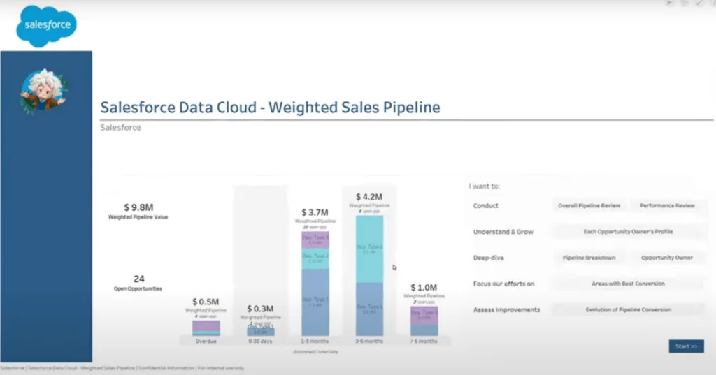
Source: Salesforce, Weighted Sales Pipeline
The example of the dashboard above pulls Salesforce sales pipeline data to offer actionable insights on performance and forecasting. By weighting deals according to their likelihood of closing, it produces a realistic pipeline value. Users can track overall results, identify key opportunities, analyze salesperson performance, and examine individual deals in detail.
For those who prefer a more traditional look, pipeline reports can also be formatted in tables in slide decks – for example, a slide listing each stage’s total deals last month vs this month, with a little delta arrow up or down. However, the trend (and recommendation) is to move to the dynamic dashboard style, as shown, because it’s more engaging and easier to interpret quickly.
Let’s describe what an exemplary sales pipeline report might contain visually:
- Title and Date: e.g., “Q4 2026 Sales Pipeline Report – as of Oct 31, 2026”. Important to timestamp it since pipeline data is perishable.
- Summary KPIs at top: Big numbers or gauges for Total Pipeline, Pipeline Coverage (perhaps as 3.2× vs target), Current Quarter Forecast, Closed Won to date, etc.
- Pipeline by Stage chart: Could be a horizontal bar chart or funnel image, showing both count of deals and value at each stage. If using a funnel, the width of each segment reflects deal count/value. If a bar chart, you can have two bars per stage – one for count, one for value – or simply value labeled with count.
- Conversion Metrics: Perhaps displayed as arrows or annotated on the funnel. For example, between Stage 1 and Stage 2, an arrow might say “60% conversion”. Between Stage 2 and 3, “50% conversion,” and so on. This is often color-coded (red for low conversion percentages that need improvement).
- Charts for Key Ratios: A small section might have something like a speedometer chart for win rate, or a thermometer-style chart for quota attainment vs pipeline.
- Regional or Segment Breakdown: If applicable, a stacked bar for pipeline by region or a pie chart by product line can be present.
- Historical trend chart: e.g., line chart of pipeline value over the last 6 quarters, with a marker for current quarter.
- Detailed Deal Table: List of critical deals as mentioned (could be appended in an appendix or interactive detail panel).
- Notes or Explanations: Some pipeline reports include footnotes or callouts like “Note: Pipeline figures include New Business only, excludes renewals” or “Big jump in pipeline in August due to XYZ event”. These help viewers understand anomalies.
By visualizing data effectively, the pipeline report becomes not just a spreadsheet of numbers, but a storyboard of your sales process. The example dashboard we embedded gives a sense of how one might look – combining summary stats with deeper breakdowns, all in one view.
For someone who’s never seen your pipeline report before, a good visualization lets them grasp the state of sales in a minute or two. For your team, having these visuals consistently allows everyone to track progress and spot issues together. It turns the pipeline review meeting from a tedious recital of deal statuses into a focused discussion on metrics and strategy (because the visuals have already compiled the statuses into insights).
In practice, many executives start their day or week by glancing at a pipeline dashboard like this. For instance, a CRO might log in Monday morning and immediately see if pipeline grew or shrank since last week and if any big deals changed stage. This high visibility keeps the whole org aligned and agile.
If you’re building your own, don’t be afraid to use templates. Many CRM systems and BI tools have pre-built pipeline dashboard templates (for example, Salesforce has “Pipeline by Stage” reports, HubSpot has a visual dashboard for pipeline, and tools like Coefficient provide ready templates connecting Google Sheets to CRM for pipeline analysis (13)). You can customize from there.
In summary, a sales pipeline report looks like a control panel for your sales engine. Dials, gauges, and charts show you the speed, fuel level, and performance of that engine. A quick glance should tell you if you’re cruising toward your target or if there’s a misfire to fix. By presenting your data visually, you make it vastly easier for stakeholders to understand and engage with the insights – and ultimately, to take action that keeps the revenue engine humming.
Final Thoughts on Creating a Pipeline Report That Drives Growth in 2026
In conclusion, building a sales pipeline report in 2026 is not just an exercise in reporting – it’s a strategic necessity for accelerating growth. We’ve seen how a well-structured pipeline report shines a light on every corner of your sales process, from revealing bottlenecks to highlighting winning behaviors. It empowers you (and your team) to shift from reactive scrambling to proactive planning. With the right metrics in place and a regular review cadence, your pipeline report becomes an early-warning system and a roadmap for revenue success. You’ll know exactly where to invest your energy, whether that’s generating more top-of-funnel opportunities or coaching the team to improve conversion rates at a specific stage.
Remember, effective pipeline management is a continuous improvement loop: measure, analyze, act, and repeat. The companies that master this – often through the help of data-driven pipeline reports – are the ones leading their markets. They forecast accurately, adapt quickly, and hit their targets consistently. In a fast-evolving B2B sales landscape (hello AI, digital buying, and economic swings), having that grip on your pipeline is what separates the achievers from the rest.
The good news? You don’t have to do it alone. If you’re reading this and thinking, “This sounds great, but we could use some expert help implementing it,” Martal Group is here for you. Martal Group is a B2B sales partner that specializes in building and optimizing sales pipelines for growth-minded companies. We provide services like outsourced SDR/BDR teams, omnichannel outbound lead generation, appointment setting, and even fractional sales leadership. We live and breathe pipeline development – and we bring proven processes, tools, and talent to fill and manage your funnel effectively.
At Martal, we can help you set up the right pipeline reporting structure and then keep that pipeline humming with qualified opportunities. Our team will act as an extension of your own, prospecting and nurturing leads across email, LinkedIn, calls (whatever channels work for your business) to ensure your pipeline is always robust. More importantly, we focus on quality – targeting the right prospects so that your pipeline converts into revenue. Through our AI SDR platform and experienced sales executives, we take a data-driven approach to continuously improve results (just as we’ve described throughout this guide).
Imagine having a steady flow of high-quality leads coming in, and a clear report to monitor them – that’s what Martal delivers. We also train your team on best practices, share insights on what messaging works, and help refine your sales process end-to-end. The outcome? Faster sales cycles, higher win rates, and more predictable growth. In short, we don’t just help you build a pipeline report; we help you build a pipeline that produces consistent revenue.
Ready to accelerate your sales growth? Let’s talk. Martal Group offers a free consultation where we’ll evaluate your current pipeline strategy and identify opportunities to improve. We’ll share how our omnichannel sales approach and seasoned team can plug into your organization quickly to start delivering results. Whether you need more top-of-funnel leads, better follow-up on existing prospects, or a refined pipeline reporting system (or all of the above), we have you covered.
It’s time to take the guesswork and stress out of hitting your revenue targets. Let Martal Group help you build a thriving pipeline – and convert it into record sales. Reach out to us today for your free consultation, and let’s start turning your pipeline into an engine of growth!
Let’s build a bigger, better pipeline together – and turn those opportunities into revenue.
References
- Databox
- Copper CRM Blog
- NetHunt CRM
- Marketo
- Martal Group Sales Pipeline Consulting
- DemandGen Report
- Martal Group, AI Sales Automation
- HubSpot
- Gartner
- Poseidon
- DemandGen – Harnessing AI
- Mural Blog
- Coefficient.io
- Spotio
- HubSpot – Sales Pipeline
- Forecastio
- RTD Insights
- Claap.io
FAQs: Pipeline Report
What is a sales pipeline report?
A sales pipeline report visualizes all active sales opportunities across stages—showing how many deals are open, their value, and likelihood to close. It helps teams forecast revenue, identify bottlenecks, and measure conversion efficiency in real time.
How do you build a sales pipeline report?
Define your sales stages, pull opportunity data from your CRM, and organize it by stage and value. Add key metrics like win rate, deal size, and coverage ratio. Use dashboards or charts for clarity, and update weekly for accurate forecasting.
What metrics should be included in a pipeline report?
Include total opportunities, pipeline value by stage, win rates, average sales cycle, and pipeline coverage ratio. Add conversion rates and forecasted revenue to assess performance and predict future growth accurately.
How often should teams review their pipeline report?
Pipeline reports should be reviewed weekly to track deal movement and forecast accuracy. Real-time dashboards or automated updates provide even greater visibility and agility.
What’s the difference between a pipeline report and a sales forecast?
A pipeline report shows current open deals by stage, while a forecast predicts expected revenue. The pipeline report feeds the forecast with data used to project future sales outcomes.
Can small businesses use pipeline reporting effectively?
Yes. Even simple spreadsheets can track deal stages, values, and next steps. Regularly reviewing a pipeline report helps small teams prioritize high-value opportunities and prevent deals from slipping through.